Luxury eyewear design, brand creation, and campaign direction. From Sabae to Milan — objects built to last.
"Treat every collection, every design like a fine art project. Create with intention."— On design philosophy
From brand brief to finished luxury object. A twelve-step method built on manufacturing knowledge, design precision, and direct relationships with the world's best makers.
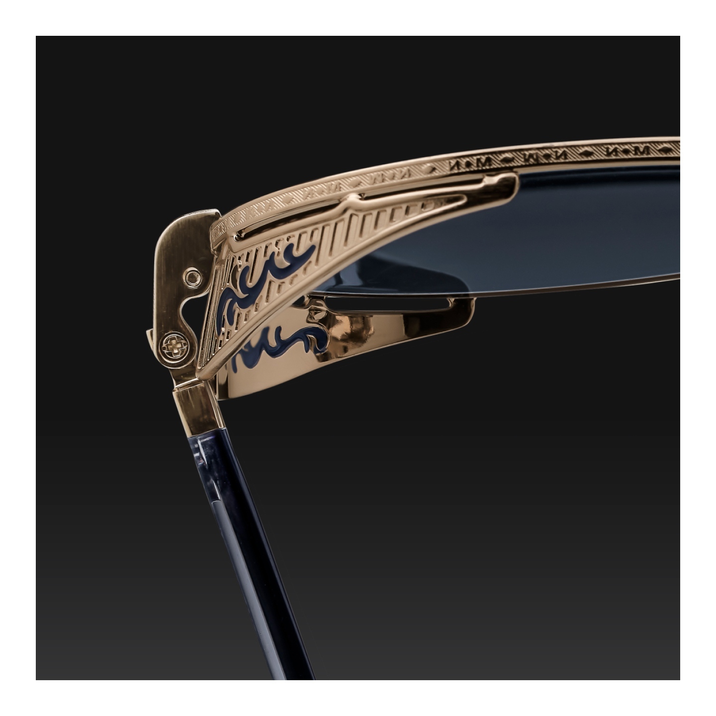


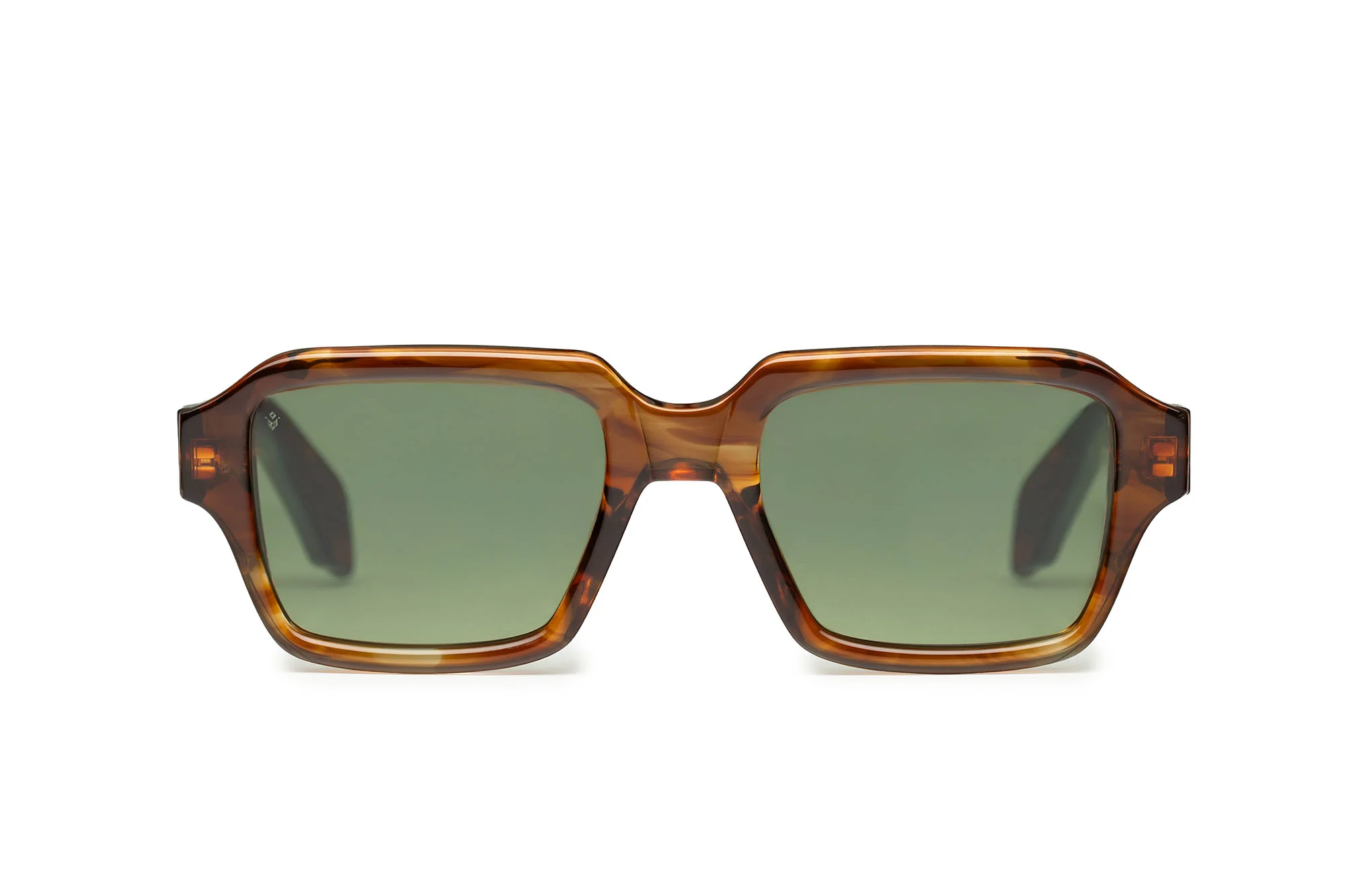
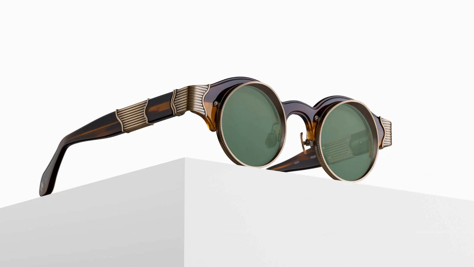
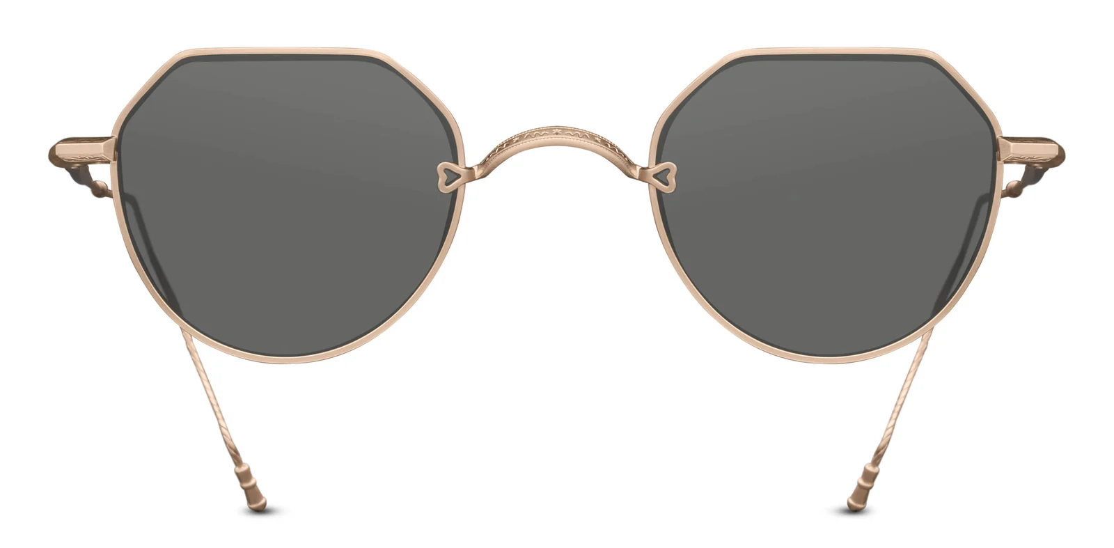
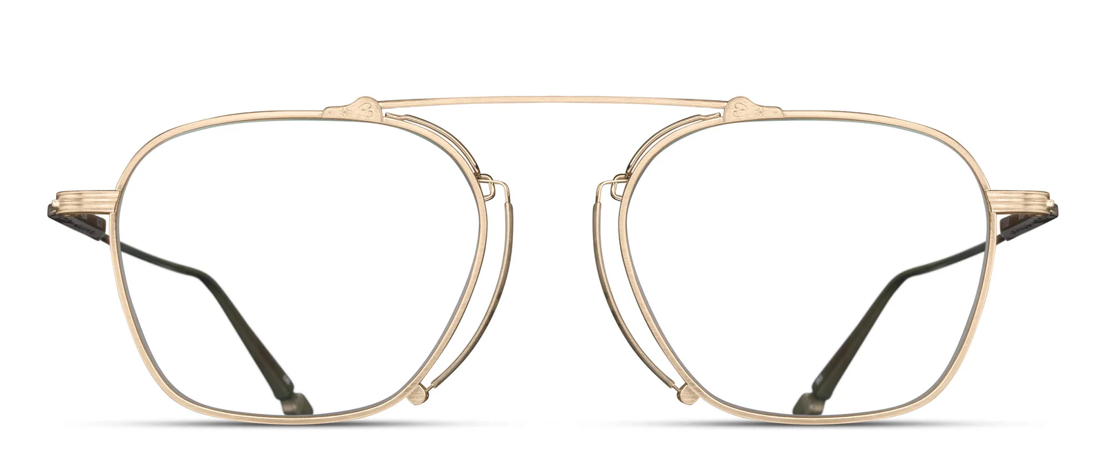
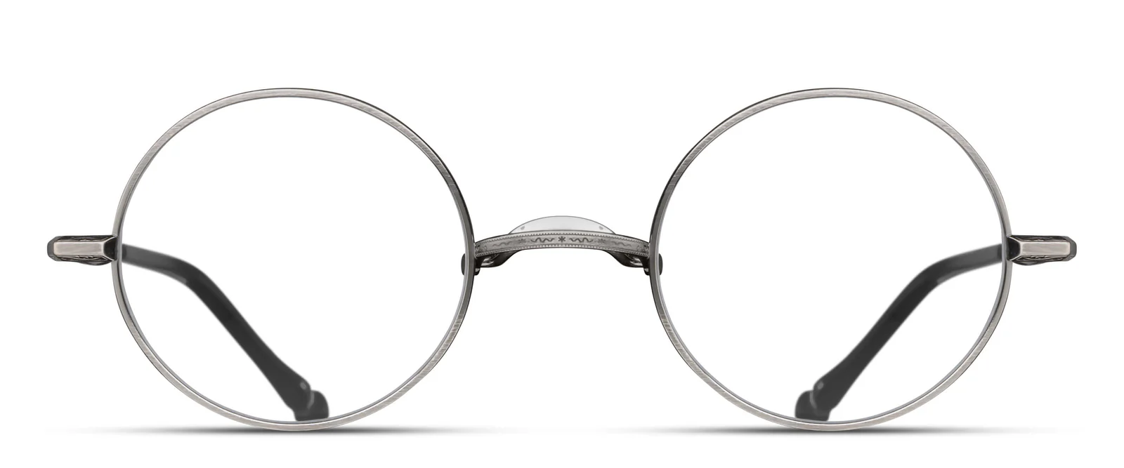
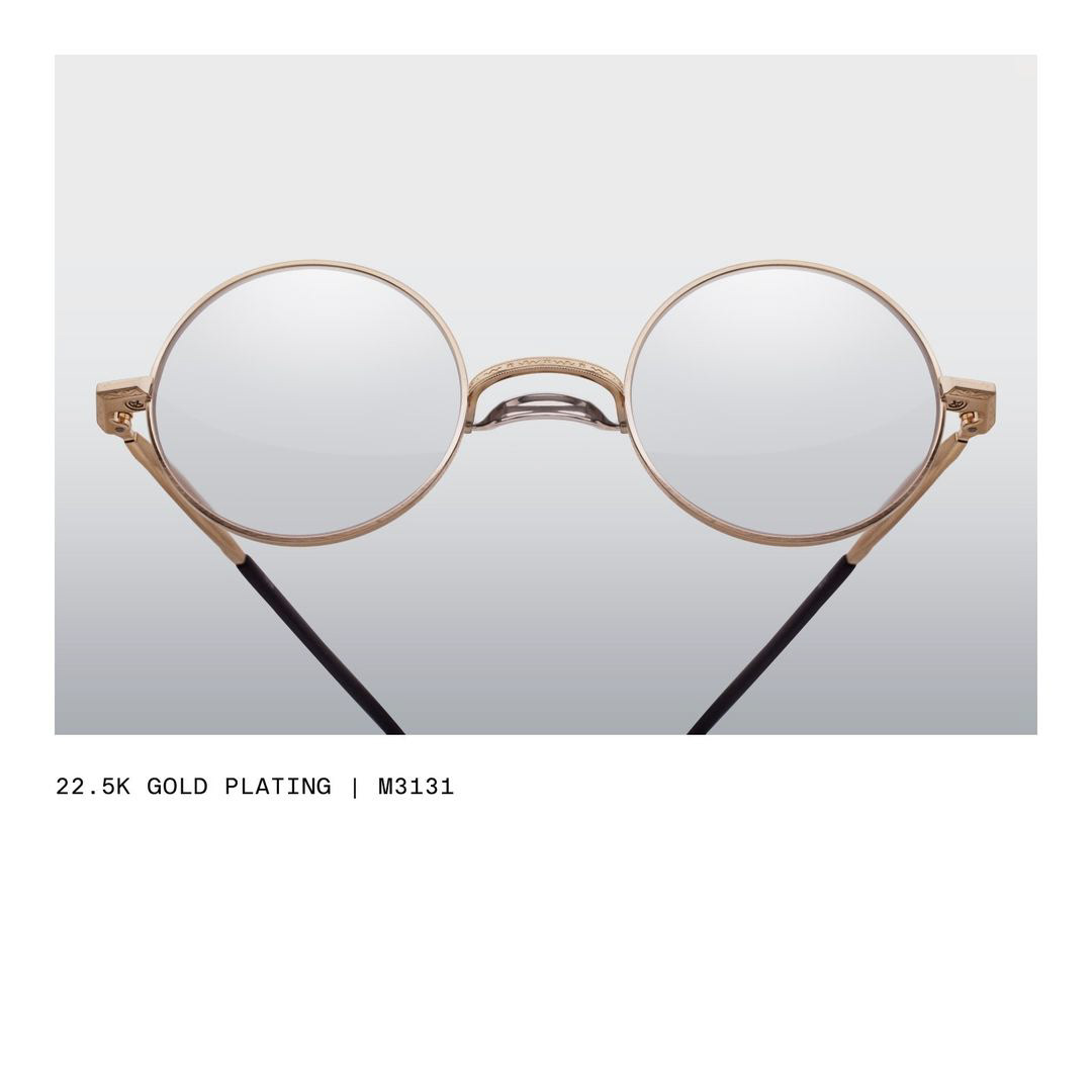
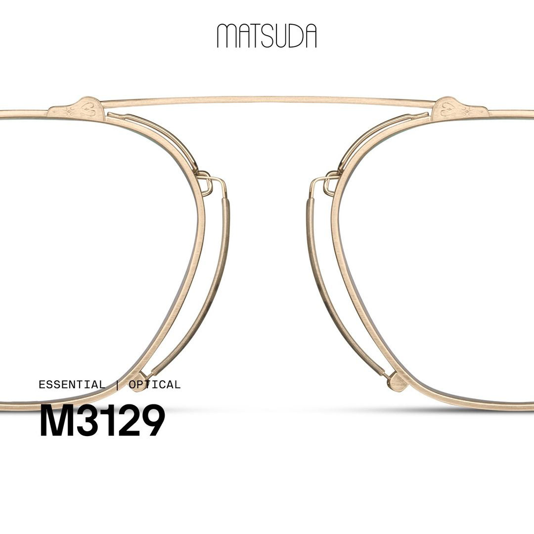
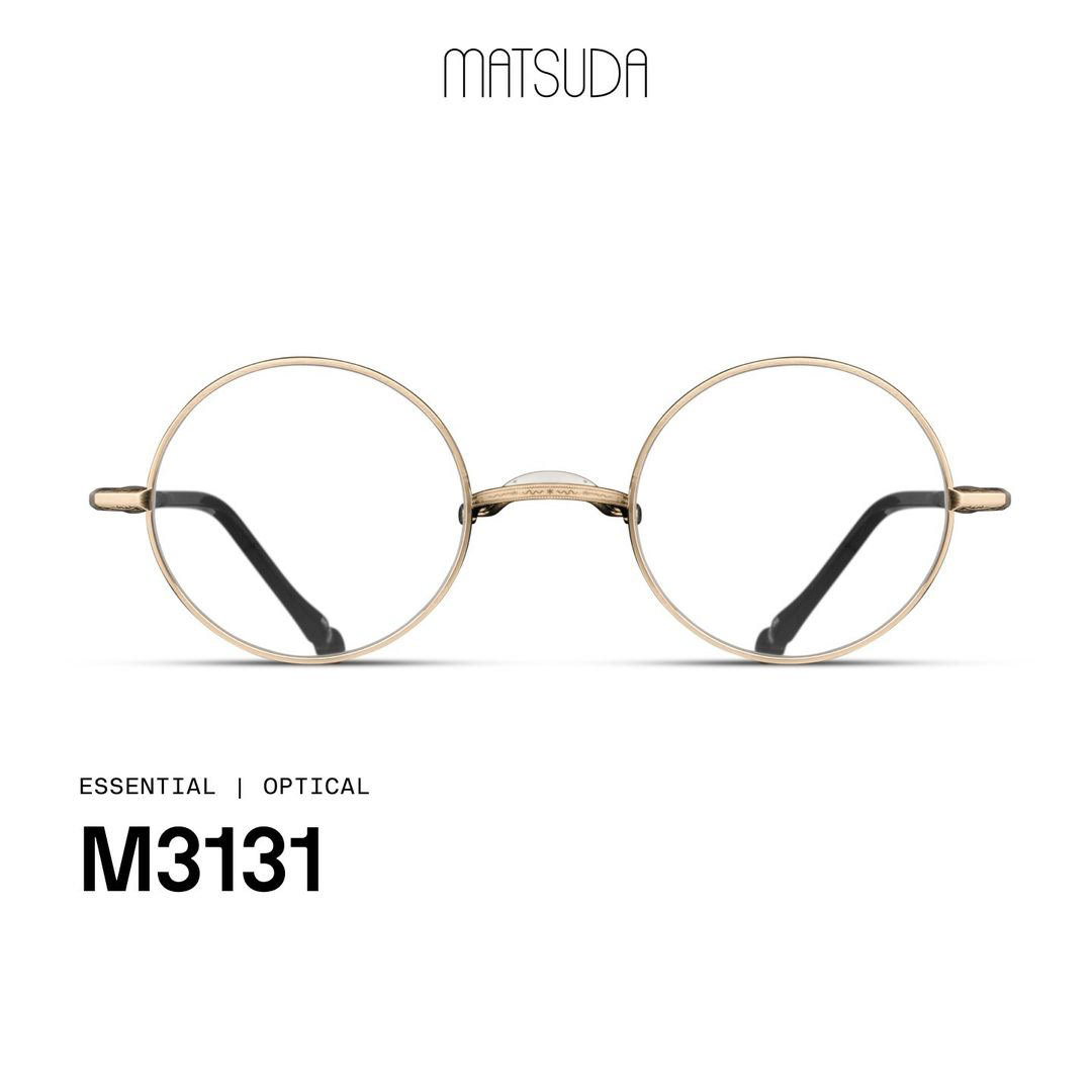
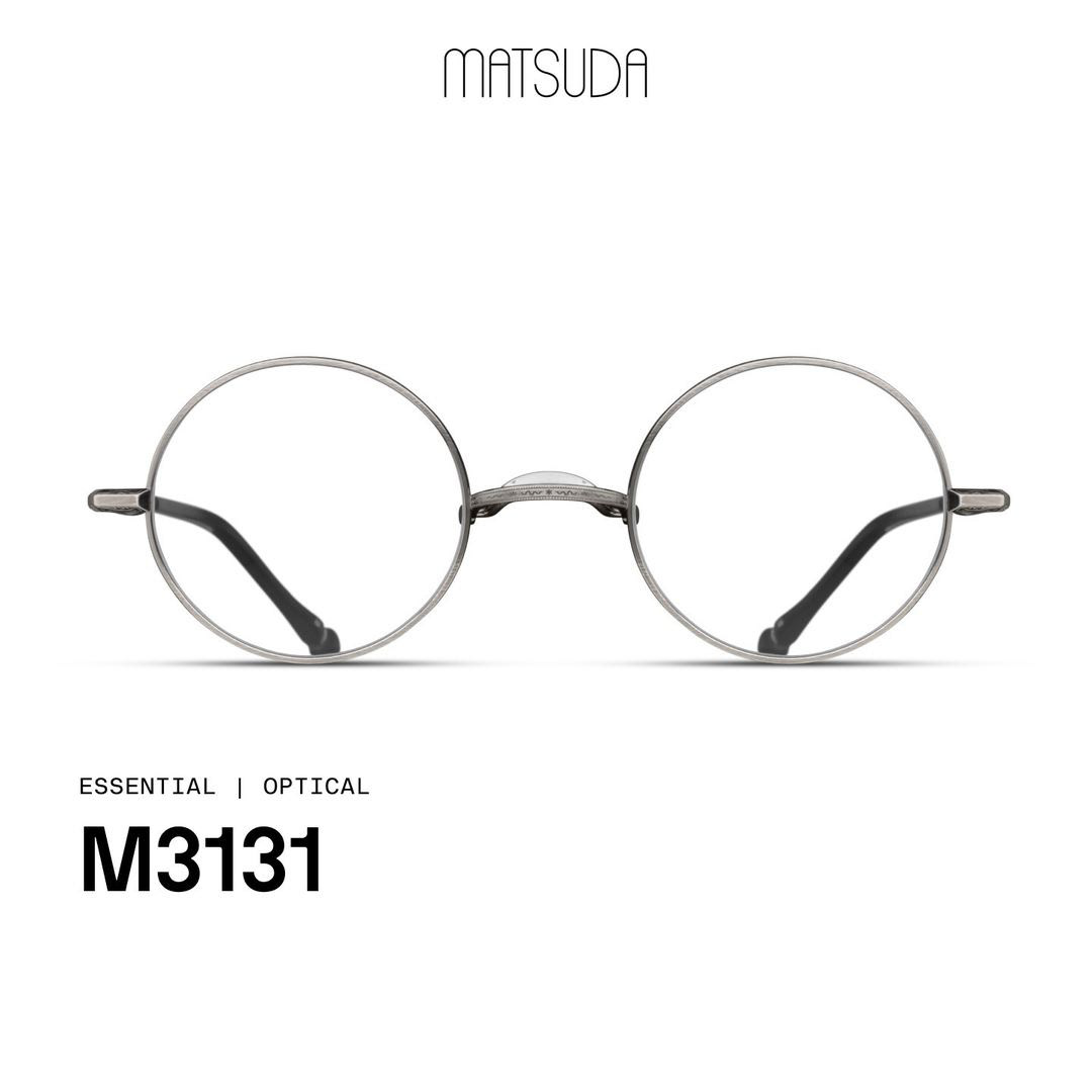
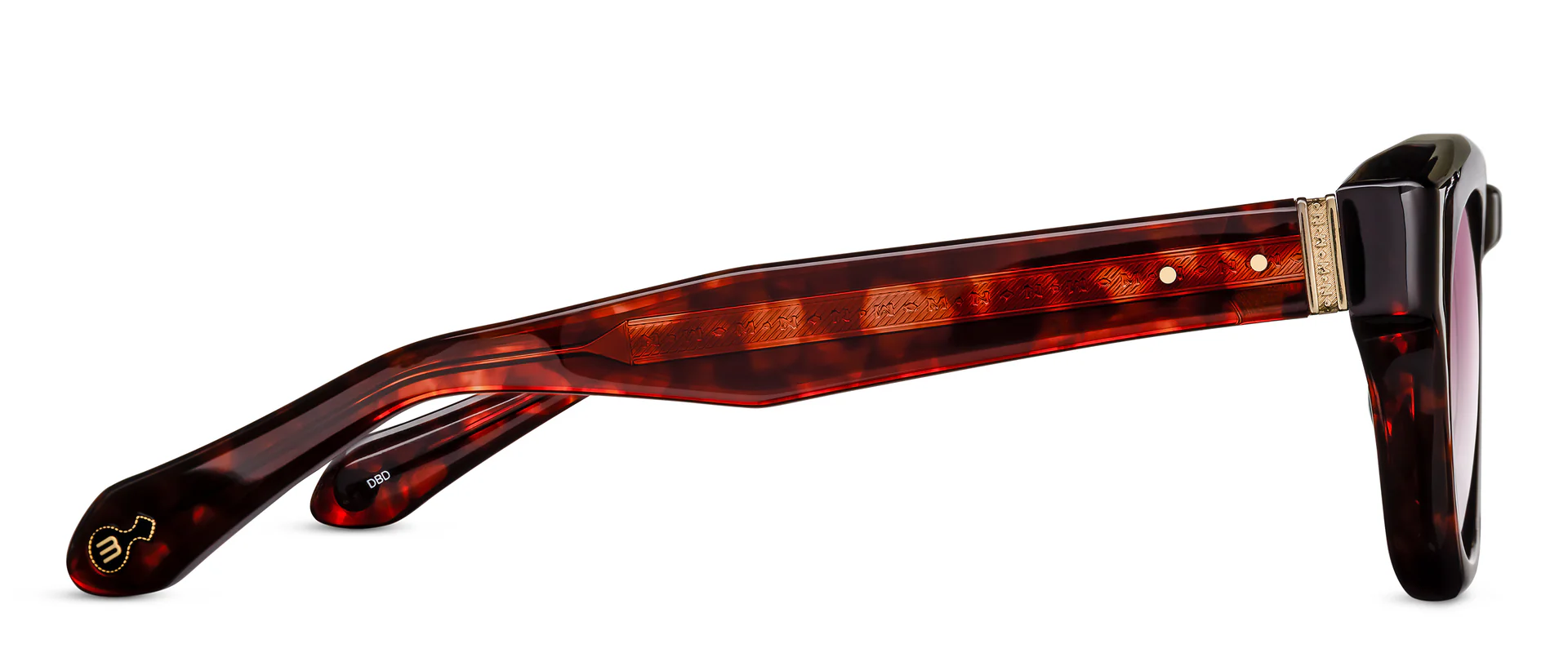
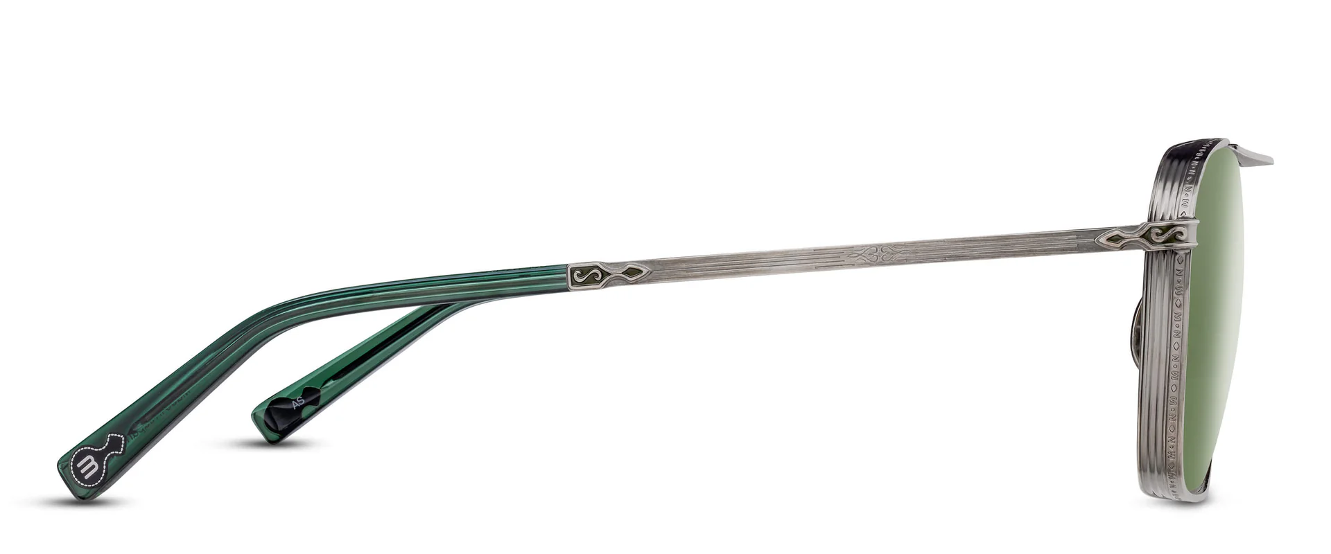
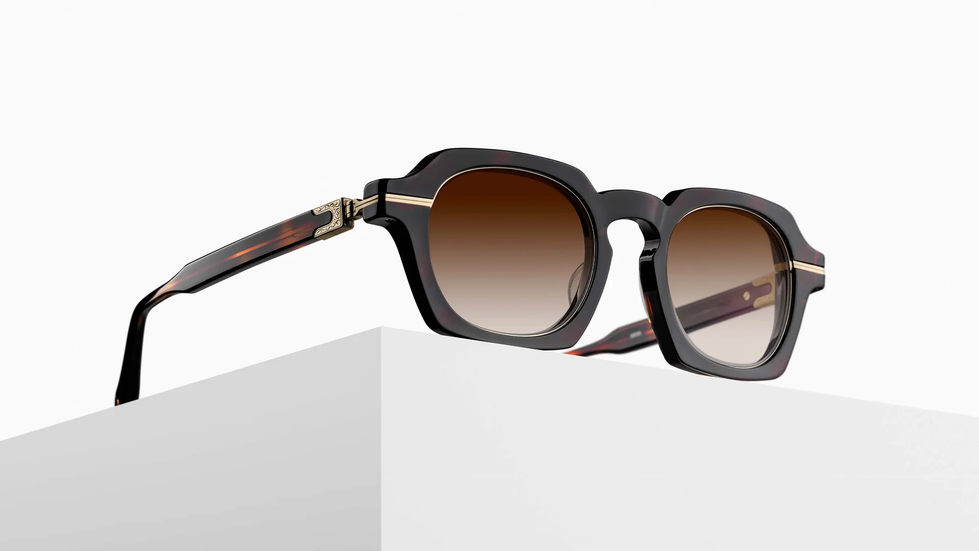
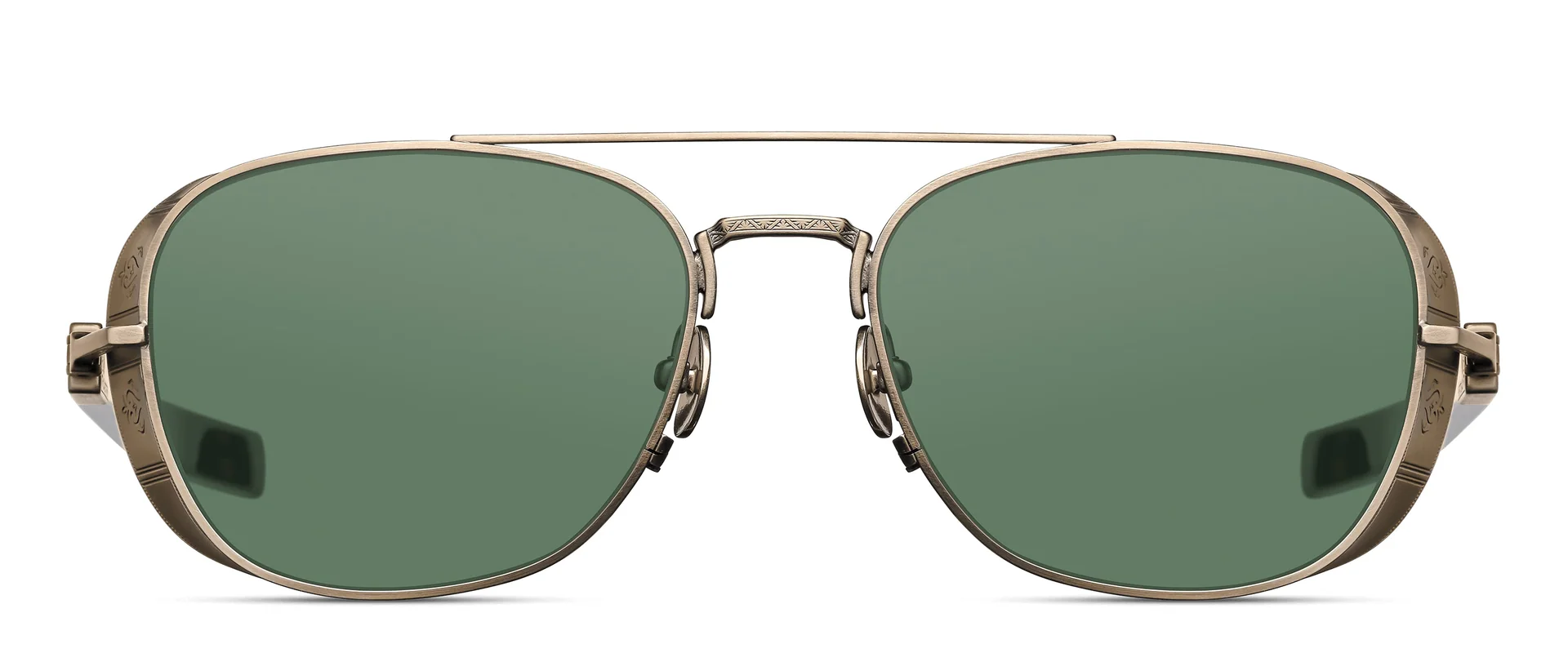
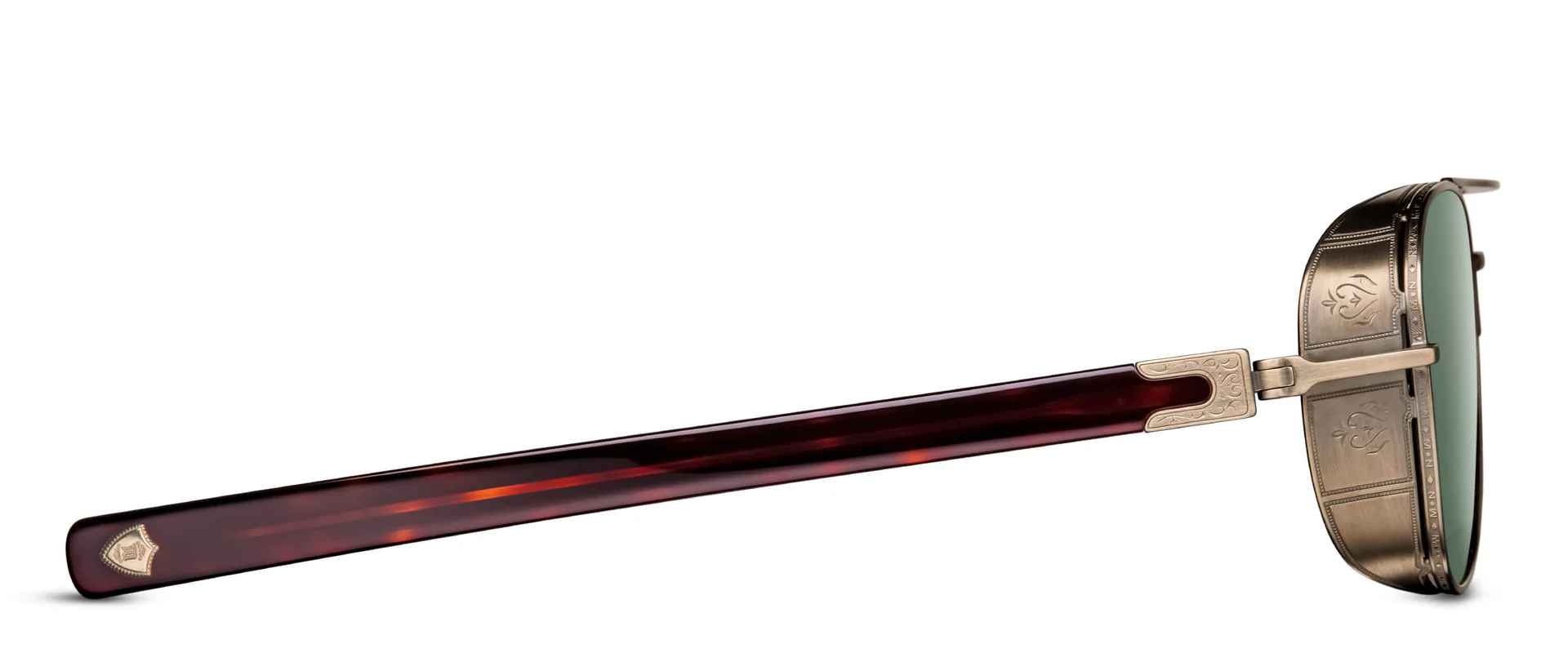
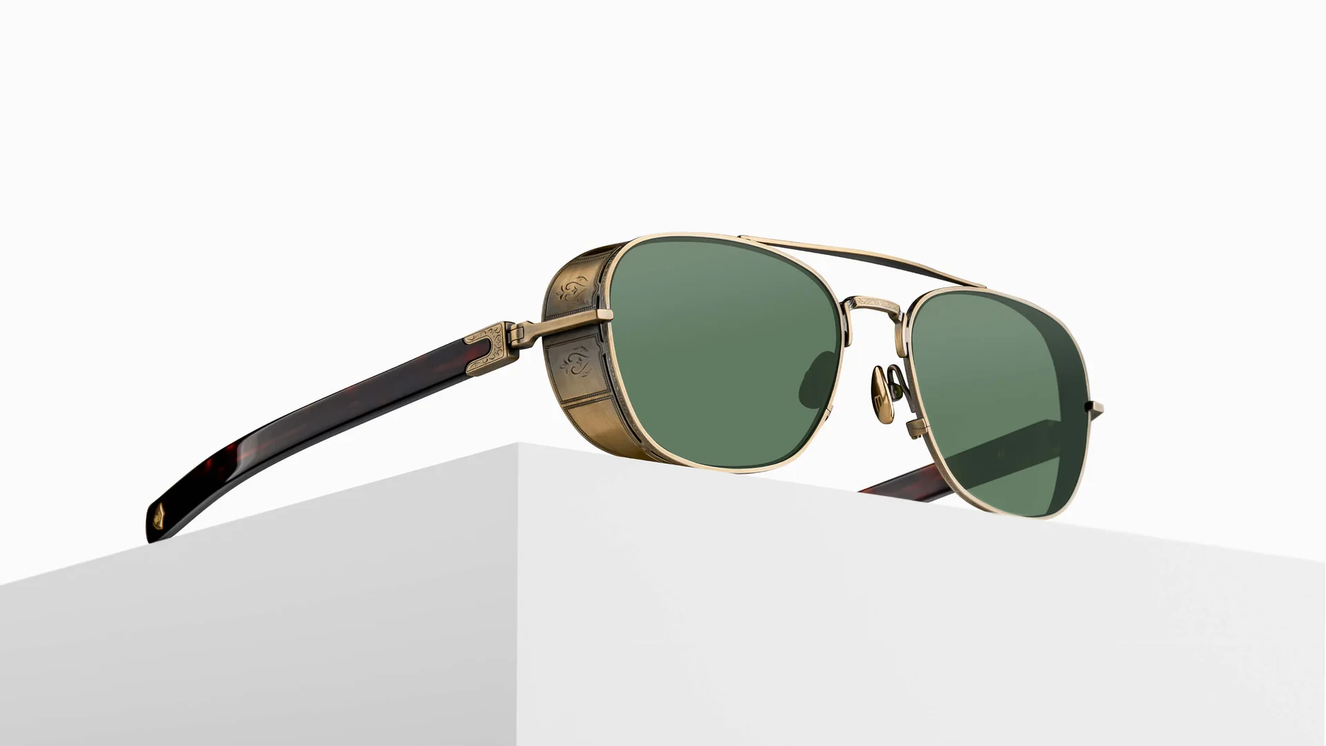
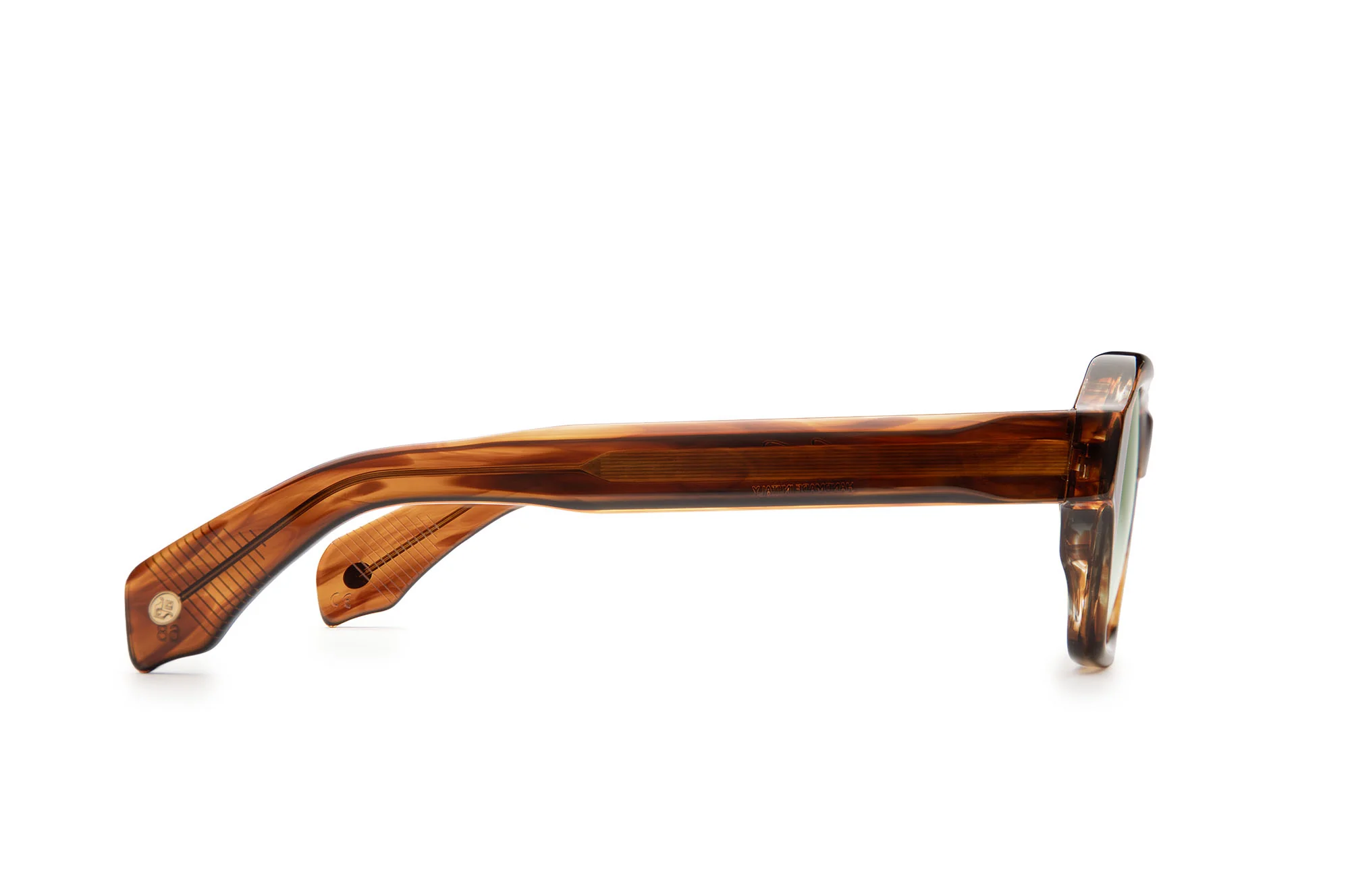
Tristan Hackman Creative solo designed the entire Genesi collection — J. Goldin's inaugural line — from first concept sketch through to production-ready frames. Eight styles. Dozens of colorways. Italian small-batch manufacturing. No existing supply chain, no template, no precedent. Built from zero.
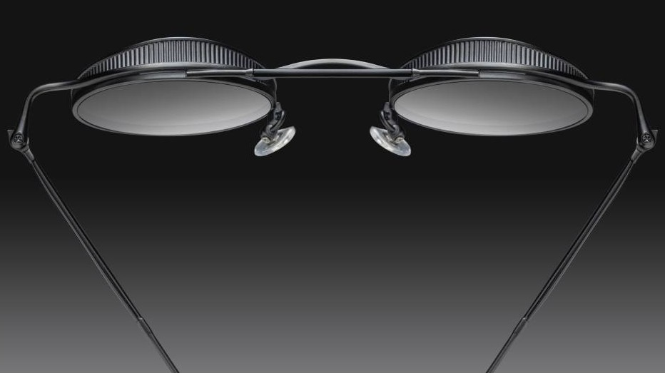
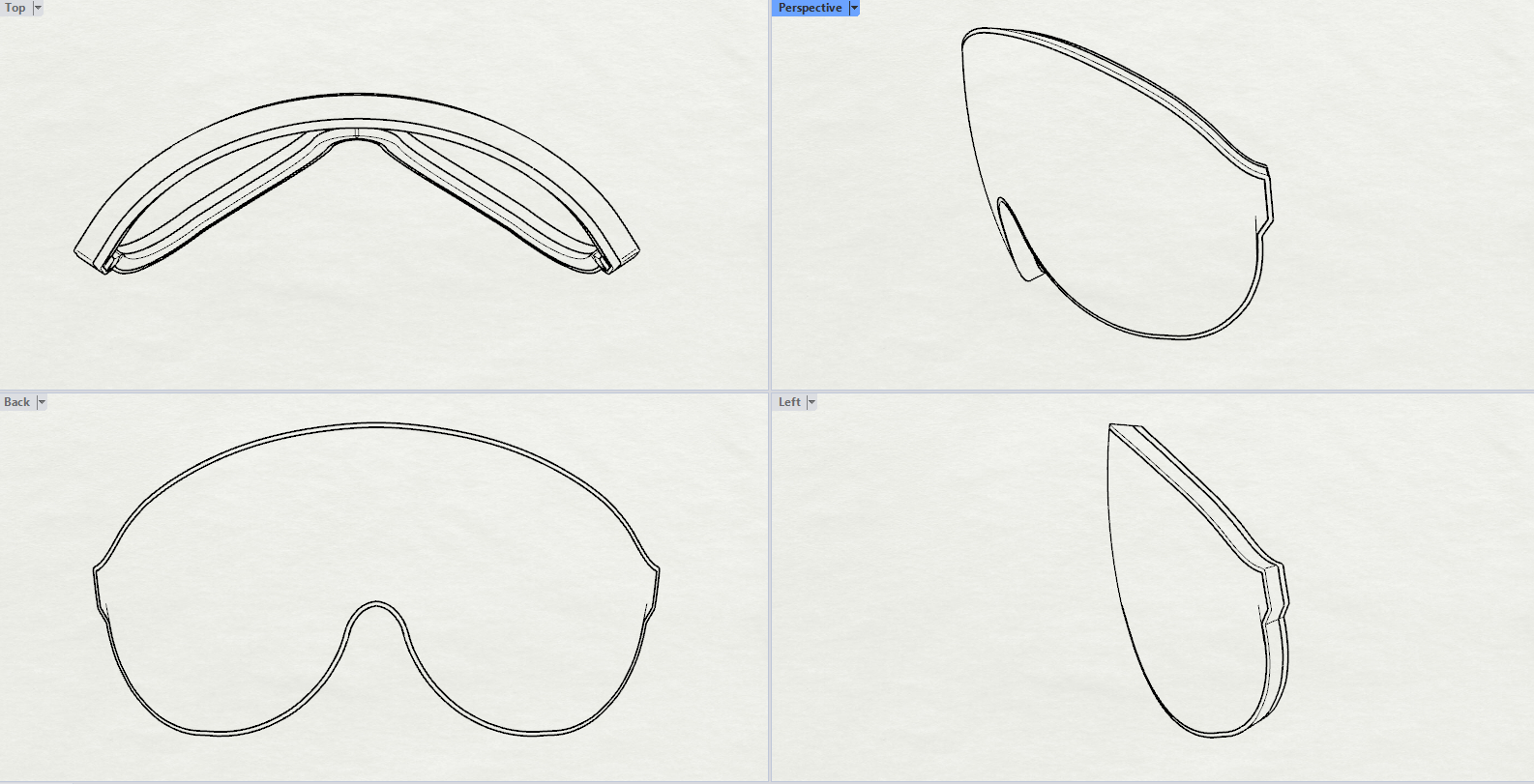
Sole designer of all eight styles — Dante, Eros, Fortuna, Jupiter, Orpheus, Stratos, Vesta, and Virgil. Created all mood boards, silhouette explorations, technical drawings in Adobe Illustrator, and 3D CAD models in Rhino from initial concept through final approval.
Personally designed all Color, Material, and Finish specifications for every style and colorway — including personally ordering and reviewing acetate samples from numerous acetate manufacturers in Italy and Japan to select final materials. Produced detailed tech packs and spec sheets covering measurements, construction notes, material specs, and hardware specifications for Italian manufacturers.
Researched and established the brand's entire production supply chain with Italian luxury manufacturers capable of small-batch artisanal runs. Managed all prototype sampling cycles, QC review, and final production sign-off.
J. Goldin needed luxury eyewear capable of standing alongside established European houses — made in Italy, small-batch, with a clear design identity. There was no brief beyond that. The collection's entire aesthetic language, from silhouette geometry to CMF palette, was originated in-house.
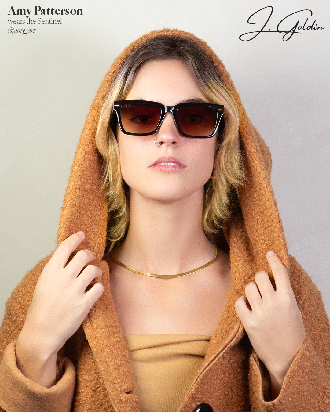
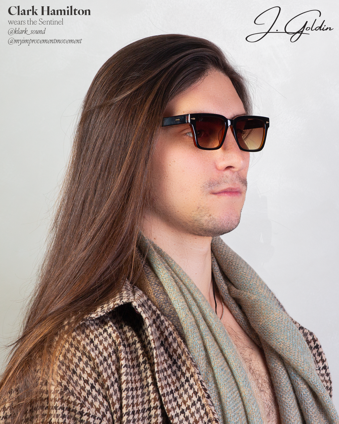
Personally shot and retouched the entire product line — establishing J. Goldin's visual identity from zero. Also served as lead photographer and creative director for the "City of Muses" launch campaign, which introduced the brand through Atlanta's artist community.
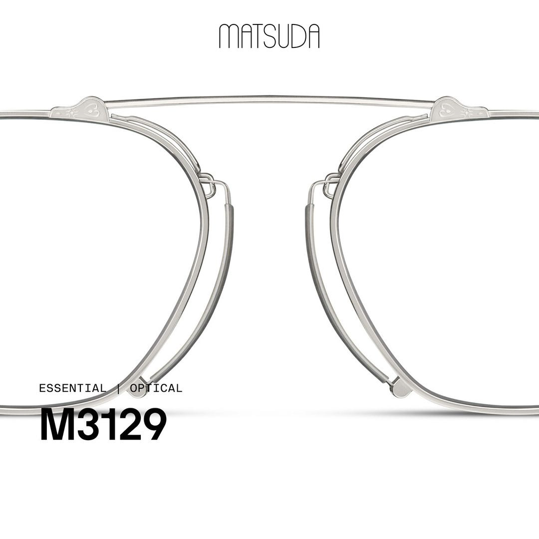
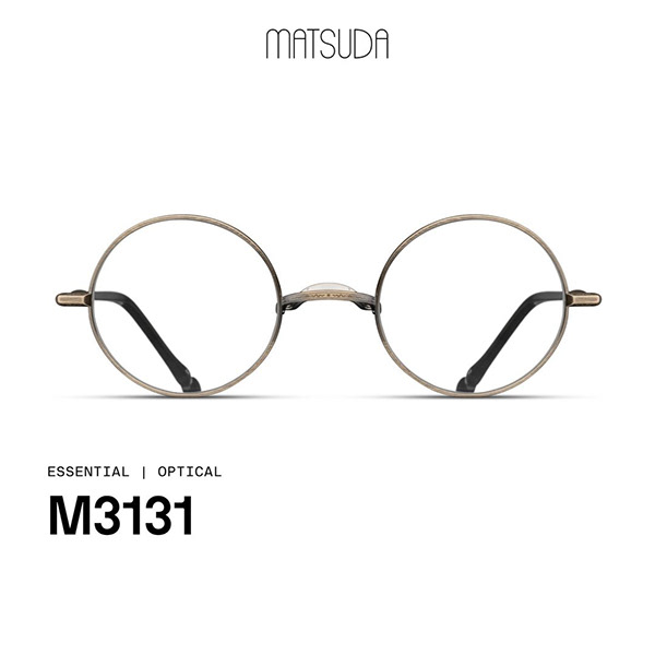
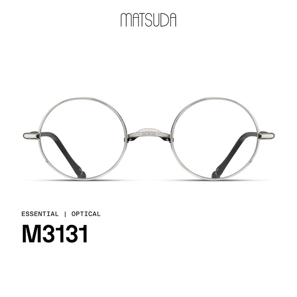
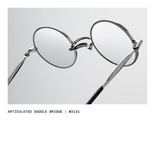
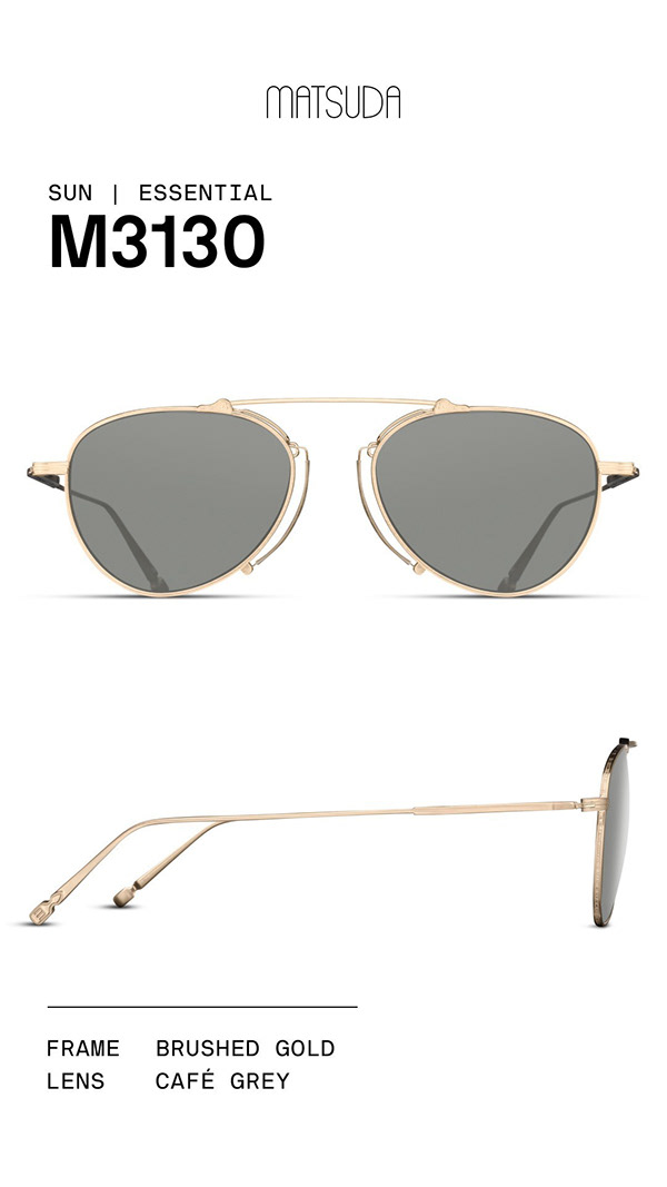
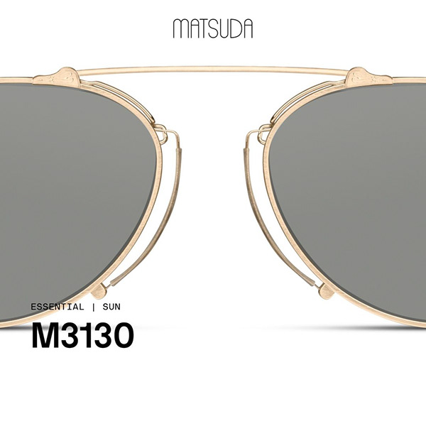
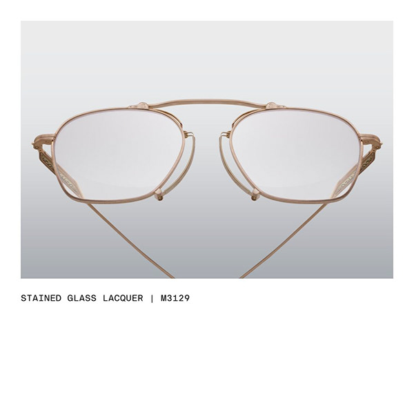
Select a style using the tabs, then switch colorways. Click either image to view full size.
"Tristan Hackman Creative solo designed the entire inaugural collection — setting the design DNA for J. Goldin as a serious contender in the luxury eyewear space."
J. Goldin needed more than products — it needed a complete identity capable of competing at the luxury level while standing apart from heritage players. I built the brand from zero: mission, vision, logo, color palette, style guide, packaging, website, photography, and launch campaign. Every touchpoint. One designer.
Defined the brand's mission, vision, values, logo, color palette, and style guide — establishing DNA that carried across every touchpoint from the physical frame to the Instagram grid.
Packaging & CollateralDesigned packaging, catalogs, and supporting materials conveying a luxury feel through material selection and extreme attention to detail.
Personally shot and retouched the entire product line. Established a consistent, elevated visual style — clean backgrounds, precise light manipulation, and a three-angle standard per style that became the brand's visual signature.
Graphic DesignPersonally designed all Instagram posts and creative content for the brand's first year — building a coherent visual language across 100+ pieces of content.
Two documents produced as part of the J. Goldin brand development — one narrative, one operational. Together they capture both the why of the brand and the how of applying it.
The full brand narrative — history, mission, vision, design philosophy, craftsmanship, and campaign. Built to introduce J. Goldin to the world with the weight and seriousness of a heritage house.
Open Brand Book →The operational design system — logo usage rules, typography hierarchy, color palette, and brand standards for every application. The document every creative partner works from.
Open Style Guide →The brand's first campaign spotlighted Atlanta's underground artist community, positioning J. Goldin as a brand rooted equally in culture and luxury. Serving as both lead photographer and creative director — shooting Atlanta artists in their environments, shaped by the J. Goldin aesthetic.
The concept was deliberate: luxury doesn't require distance from culture. It can emerge from it.
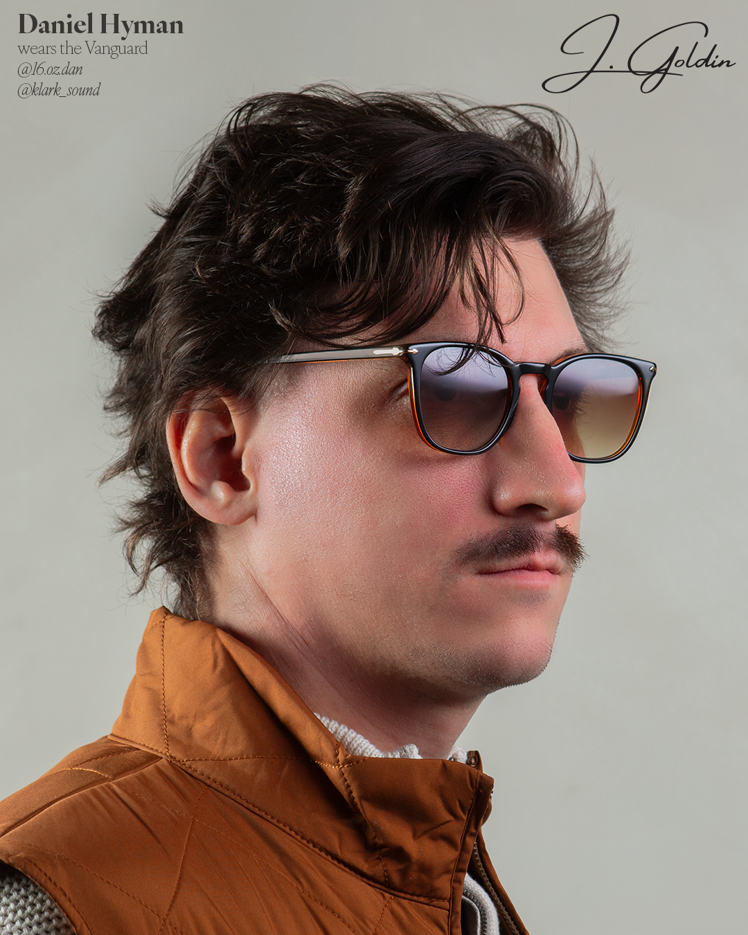
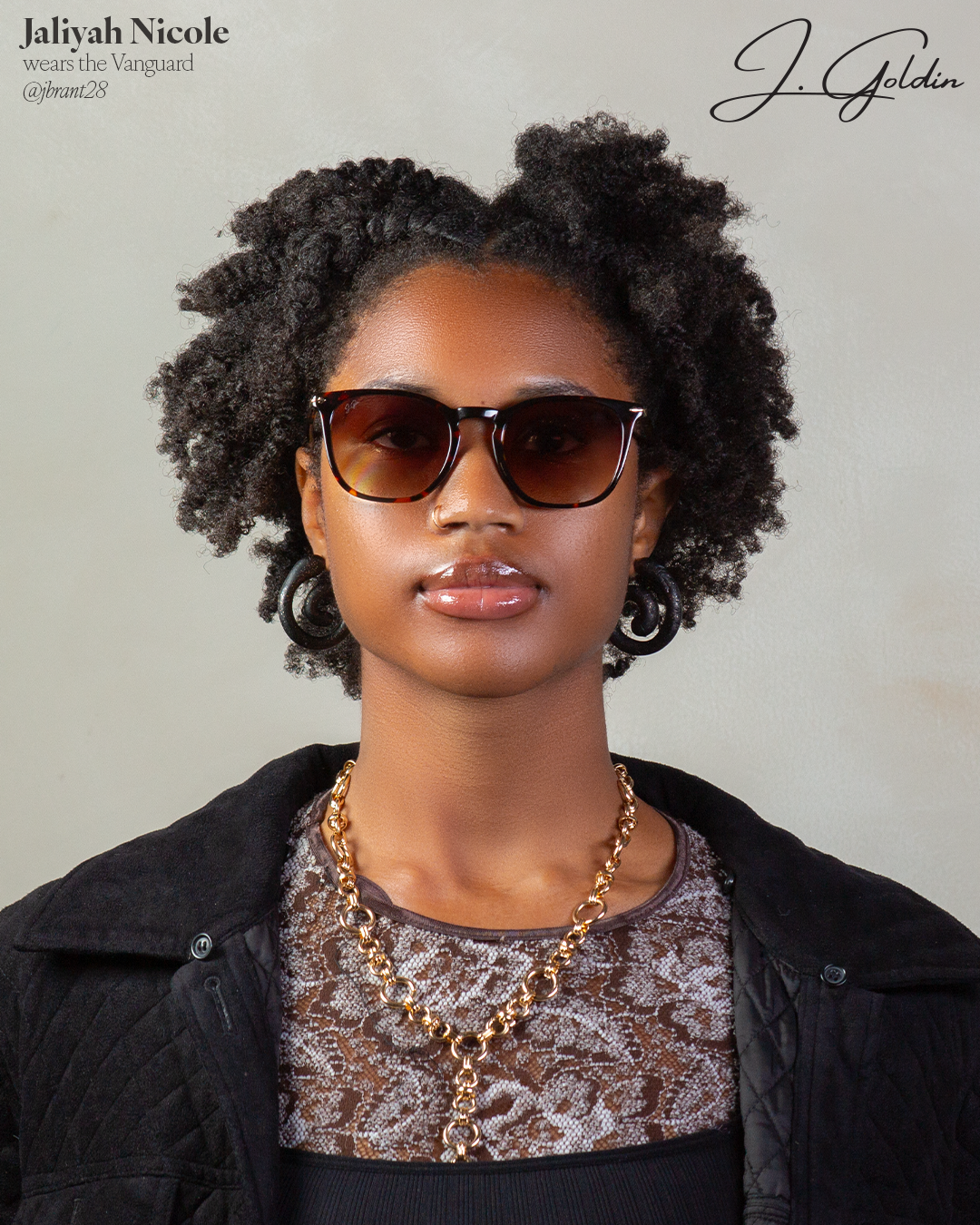


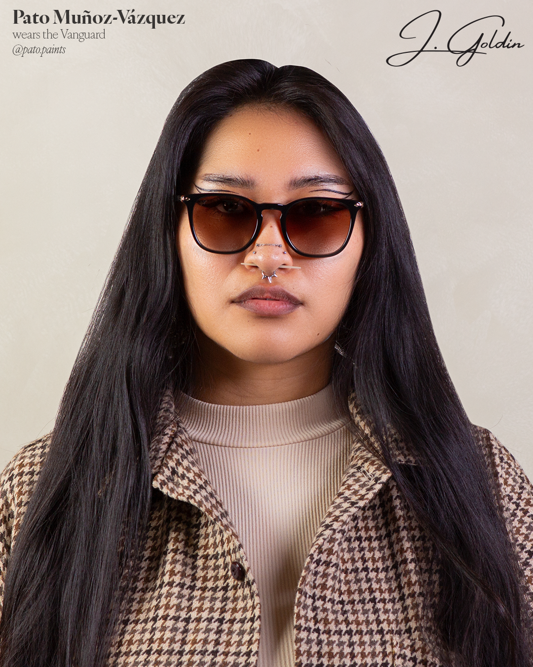

"Every detail reinforced J. Goldin's positioning as both avant-garde and timeless — with strong cultural resonance."
Eastern Outer is an independent cycling eyewear brand building a distinctive product identity in a market dominated by heavily performance-driven aesthetics. Tristan Hackman Creative was engaged to develop the brand's first original frame concept — from initial competitive landscape research through to 3D form development ready for manufacturer review.
Mapped the cycling eyewear market comprehensively — cataloguing major brands, silhouette typologies, material approaches, and aesthetic positioning. Organized findings in Figma into distinct product clusters, revealing a clear gap: the market skewed heavily toward aggressive, performance-first shield forms. The opportunity was a softer, more lifestyle-forward shield silhouette that could appeal to cyclists who also wear their frames off the bike.
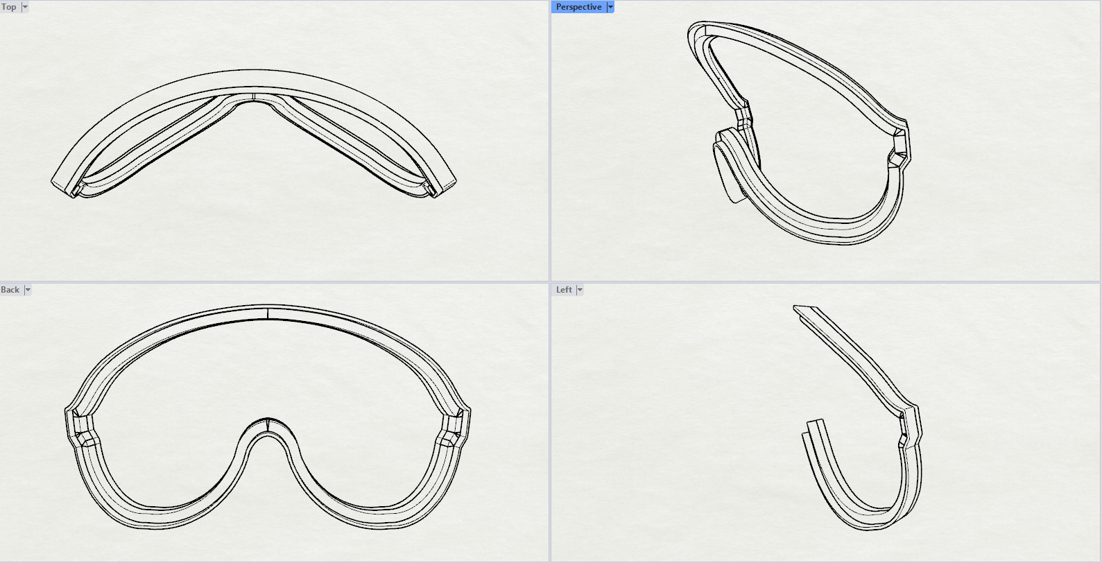
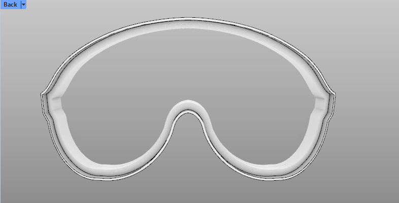
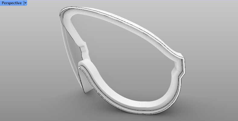
Developed the Soft Aero Shield concept in Rhino 3D — a single-lens shield design with a gently curved top bar, organic nose bridge integration, and a silhouette that reads athletic without being aggressive. The form was developed across top, front, back, and perspective views, with full wall thickness and lens channel geometry specified for eventual tech pack translation and manufacturer sampling.
The Soft Aero Shield uses a 7×4 toric lens geometry — 7mm of base curve horizontally and 4mm vertically, creating a compound curved surface that wraps naturally around the face while maintaining consistent optical clarity across the full lens span. Getting a sports shield lens right in Rhino is not a surface-modelling exercise; it requires understanding how compound curves behave at scale, how the lens interacts with the nose bridge geometry, and how wrap angle affects both peripheral vision and wind performance at speed.
The 7×4 specification was arrived at through iterative surface development against reference face geometry — balancing the aggressive wrap profile expected in performance cycling eyewear with the softer visual language of the Soft Aero Shield concept. Too much curve reads clinical; too little and the frame loses its athletic credibility. The toric geometry resolves both.
The Figma board below documents the full landscape analysis — every major cycling eyewear brand catalogued, sorted by silhouette type, and assessed for aesthetic positioning and market density. This kind of systematic competitive mapping is how design decisions are justified, not guessed. Pan and zoom to explore the full board.
Technical wireframe views and shaded renders from Rhino — showing the Soft Aero Shield front development across multiple views. The four-panel drawing captures top, perspective, back, and left angles in technical line mode; the renders show the resolved surface character and volume of the form.
Currently in development — designs are work in progress.
"The market was full of frames that looked like they belonged in a wind tunnel. The brief was to find the version of this silhouette that you'd also want to wear to dinner."
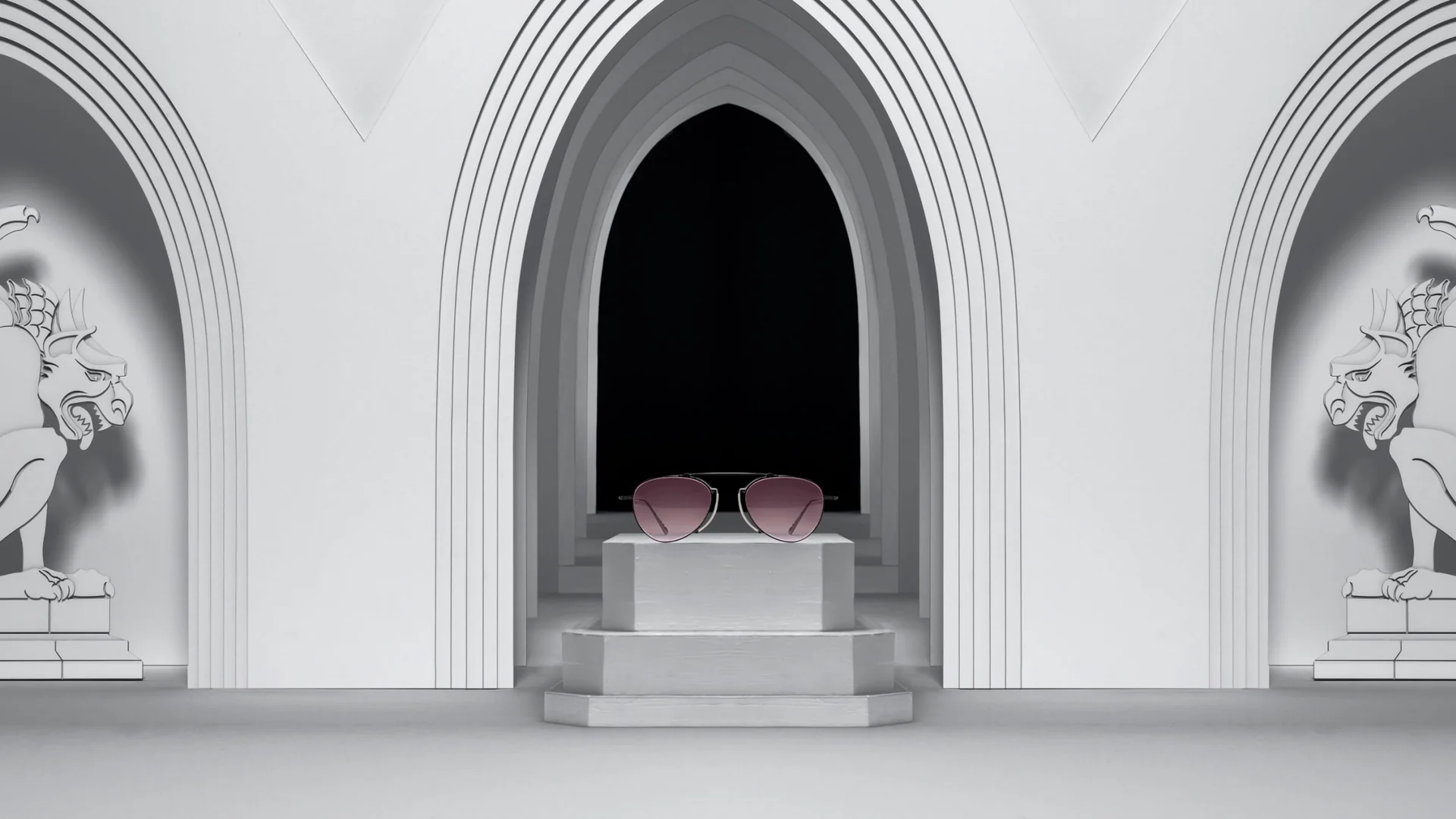
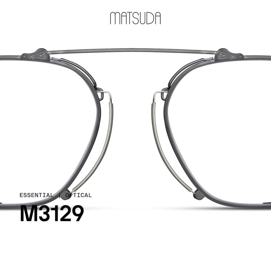
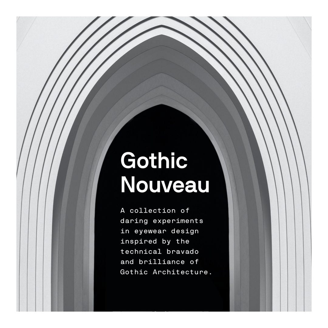
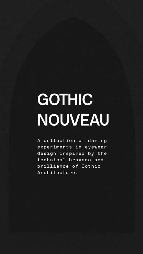
Matsuda's Autumn/Winter 2023 collection — both product and campaign — conceived from a single architectural obsession. Founder Mitsuhiro Matsuda was captivated by the technical ambition of gothic architecture during his travels in Europe. That admiration became the entire DNA of a collection.
Developed the Gothic Nouveau concept end-to-end — from the architectural reference point to the eyewear silhouettes and the surreal campaign narrative — working directly with Matsuda's CEO and Creative Director.
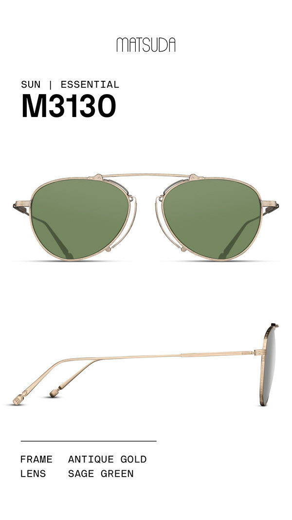
Created all technical drawings, spec sheets, and colorway specifications as part of the product design team. Managed entire product lifecycle, including prototype sampling cycles and production sign-off for 12 styles across 50+ colorways/unique SKUs.
Helped design, construct and shoot the campaign installation and all product photography. Helped design all marketing materials — Instagram posts, trade show assets, and wholesale presentations used globally.
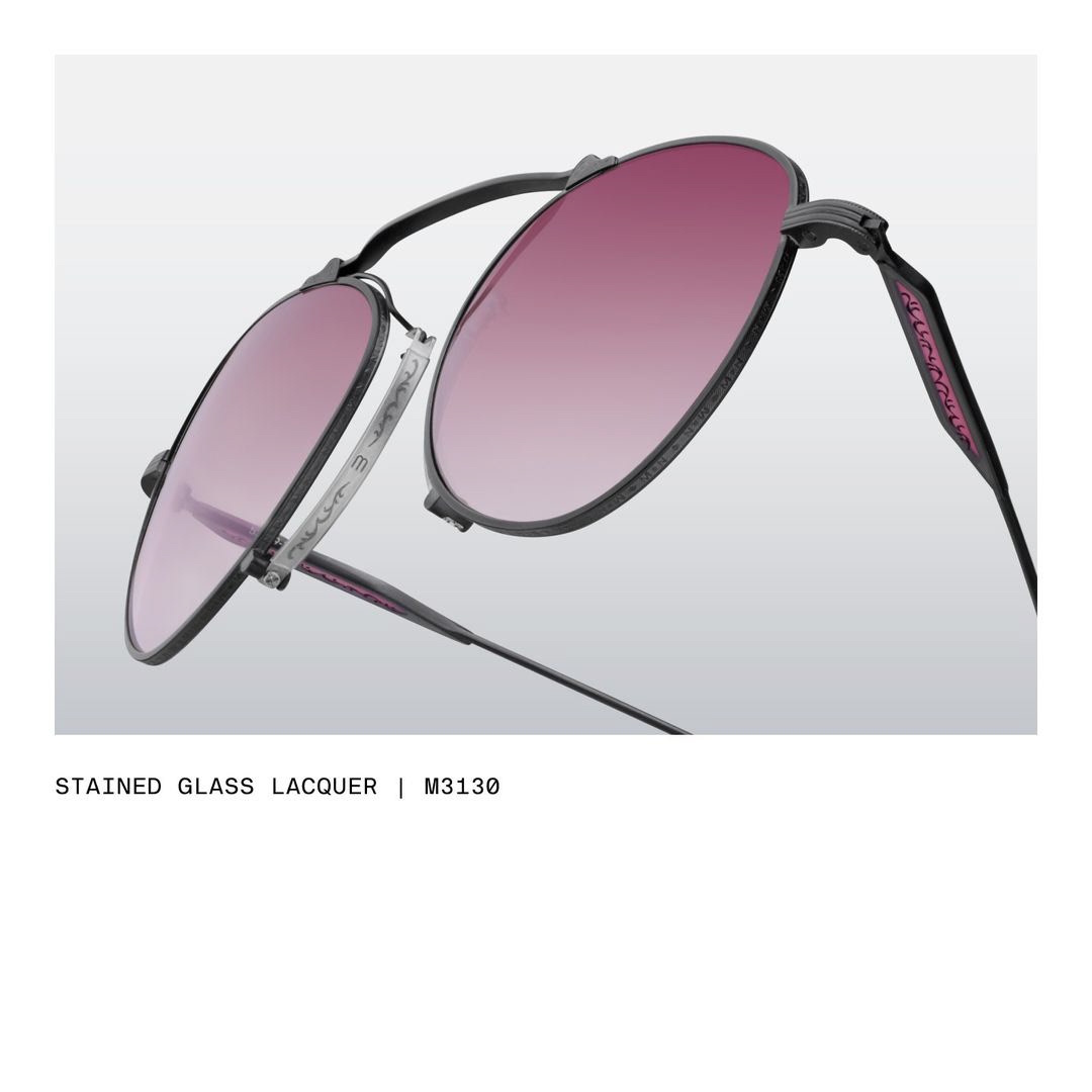
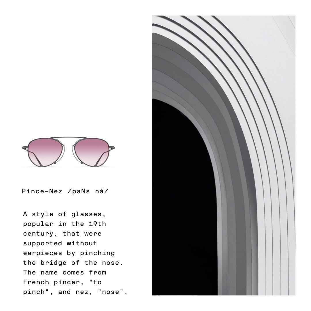
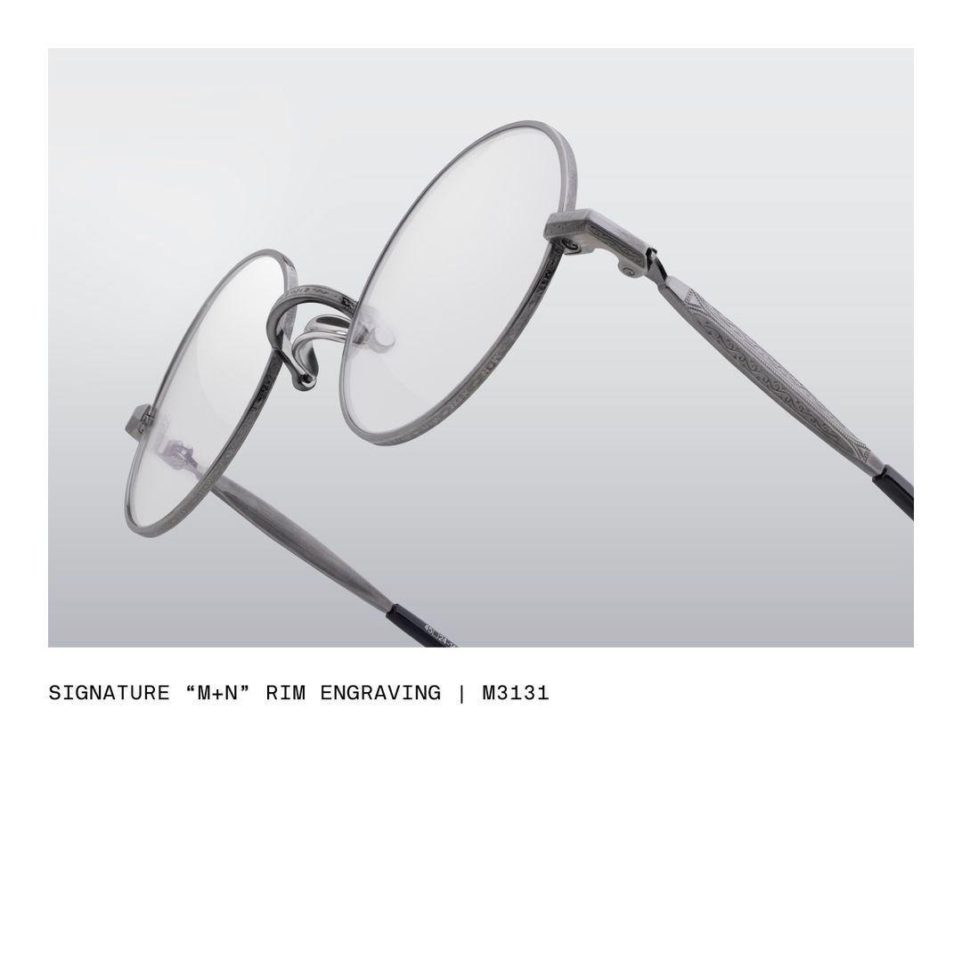
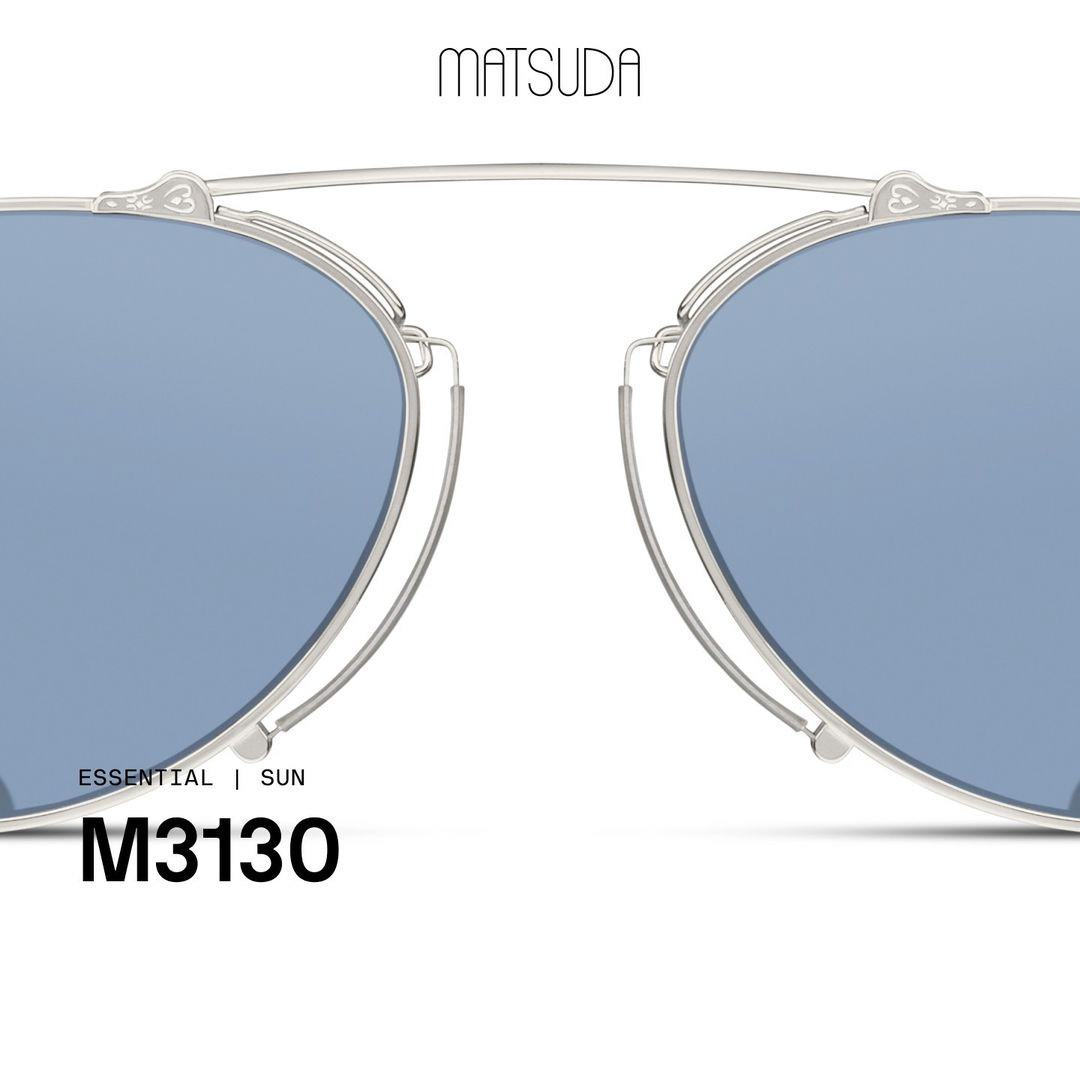
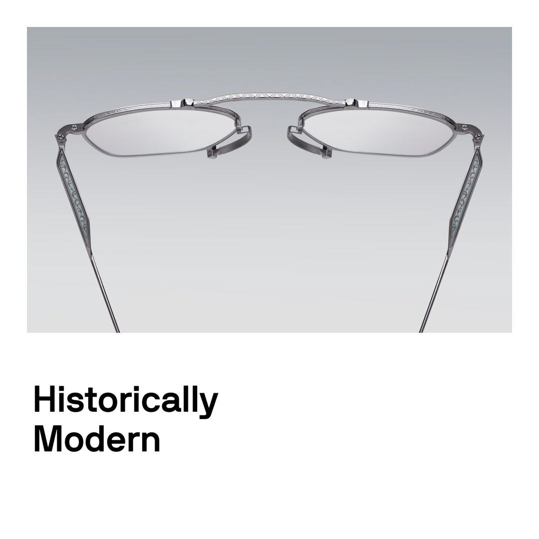
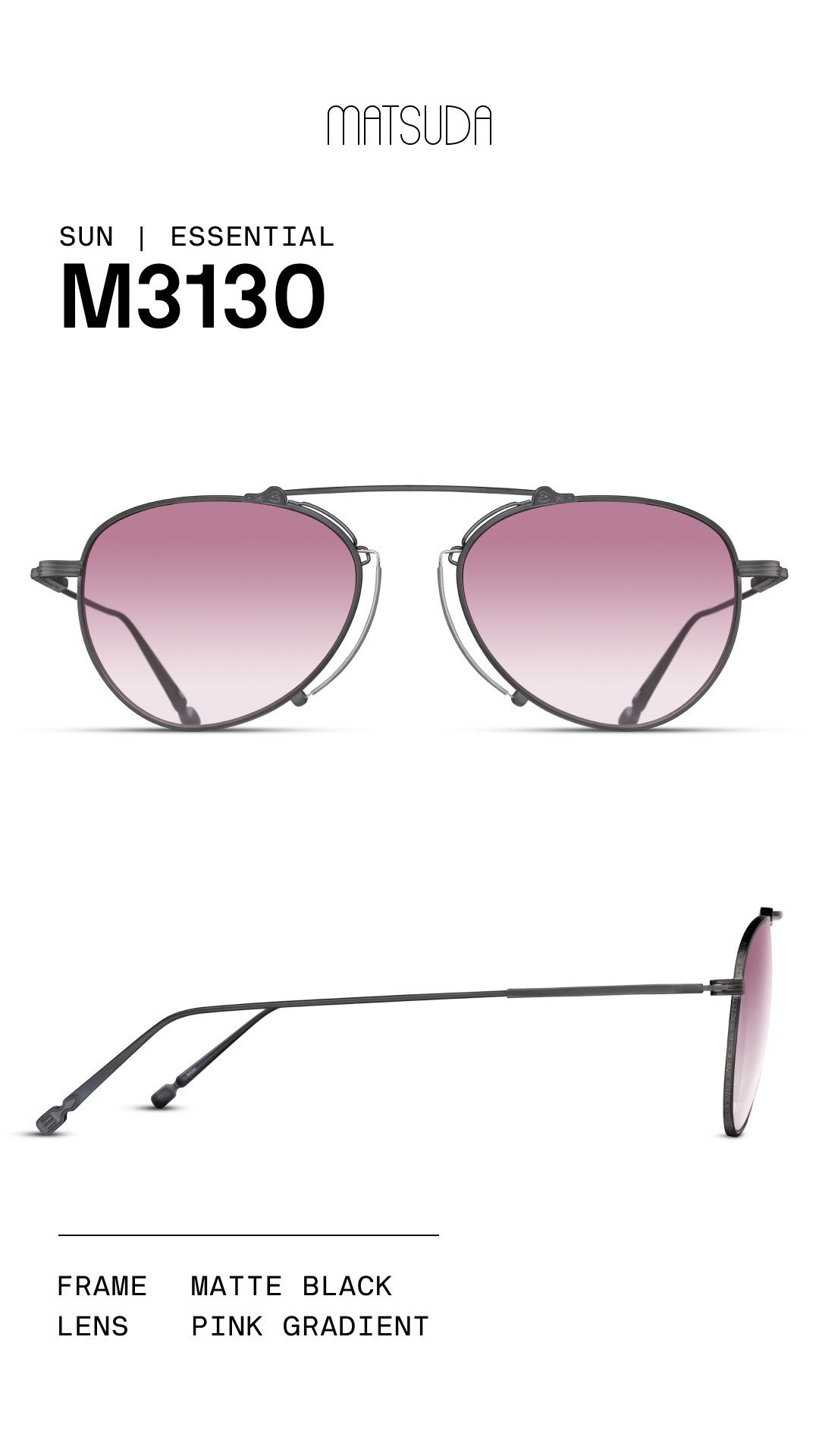
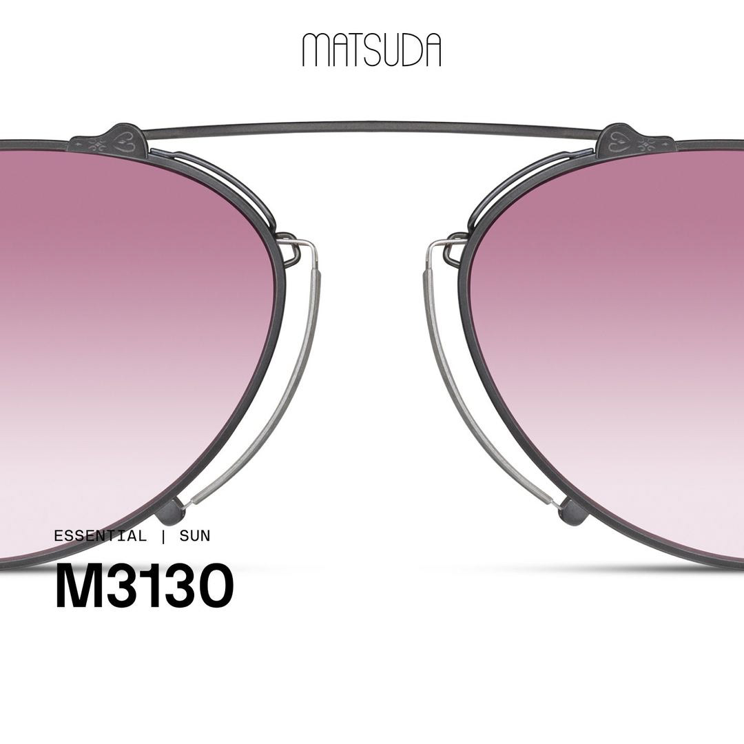
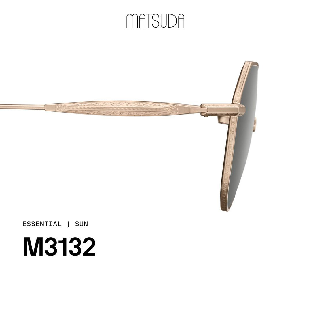
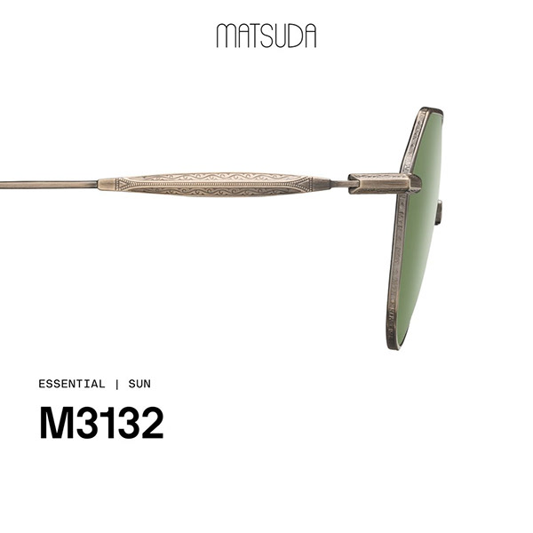
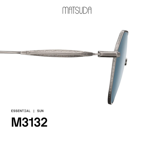
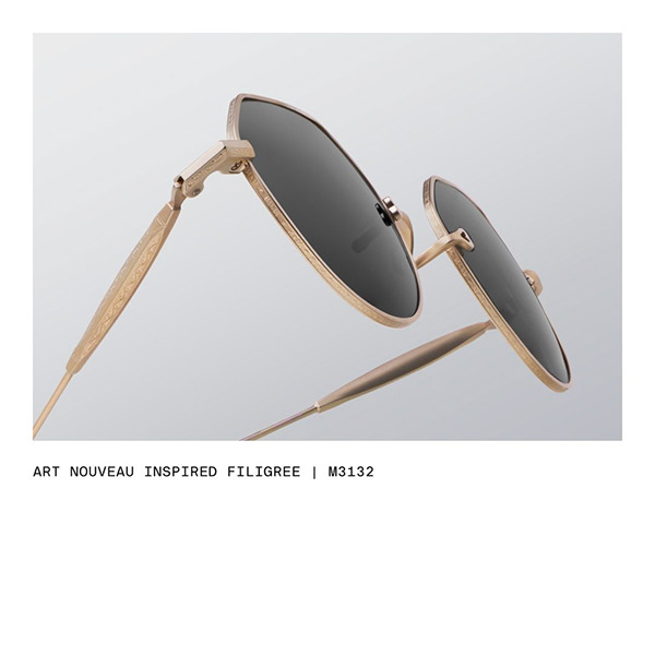
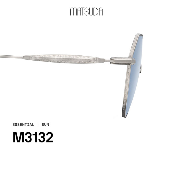
Intricate metal frames featuring stained-glass–inspired lacquer work and cathedral-shaped pince-nez bridges. The eyewear itself is a study in gothic structural vocabulary — pointed arches, tracery, engineering compressed into decorative form.
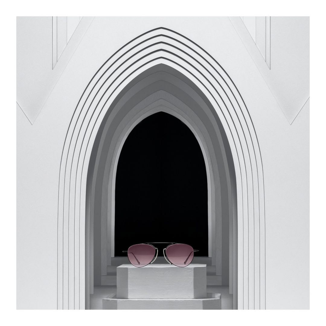
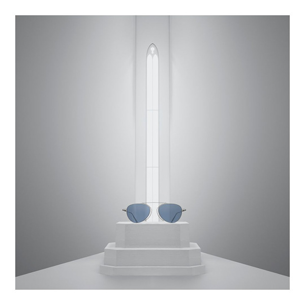
A multi-layered gothic façade built from dozens of stacked paper boards — scaled so eyewear fit within its "doorways," creating a perception play. Enhanced with 3D pedestals and arches, lit to animate the surface and amplify detail. Shown globally and as a centerpiece at Silmo Paris.
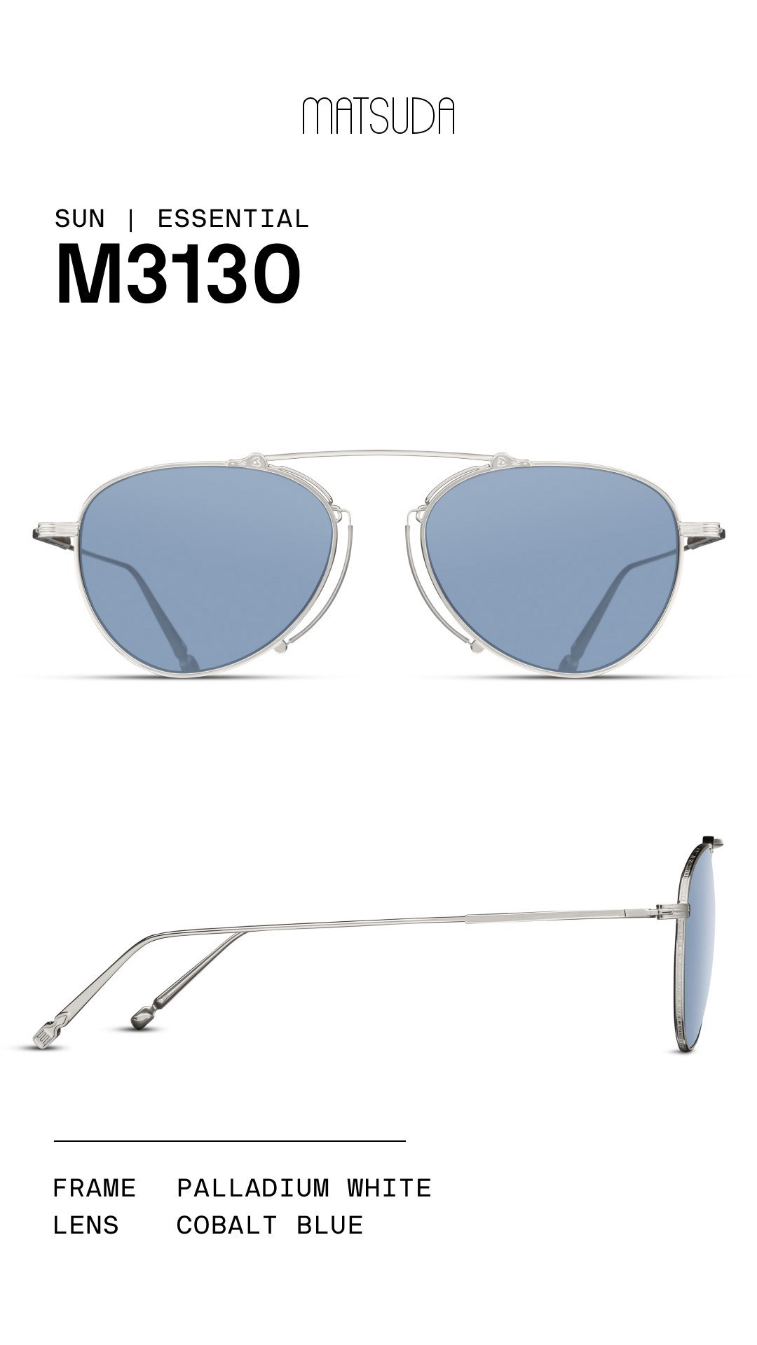
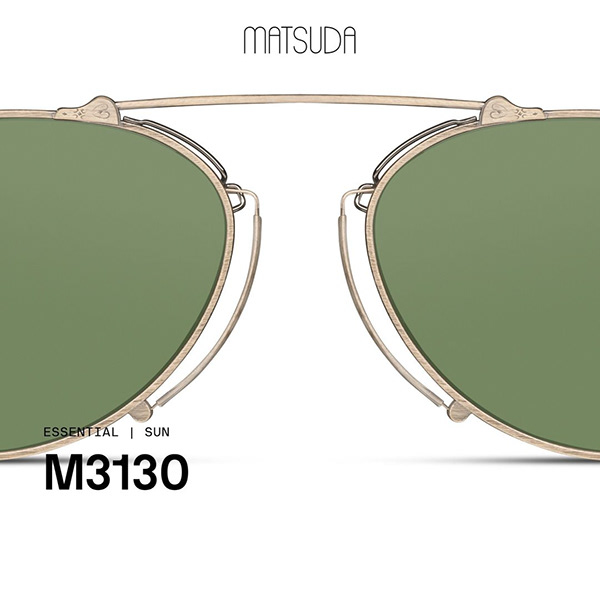
Click any image to view full size. Switch colorways and angles below each frame.
Campaign photography, product imagery, and Instagram content produced for the Gothic Nouveau release — shown globally, exhibited at Silmo Paris, and distributed across Matsuda's wholesale and retail network.
"Design, architecture, and surreal marketing merged into one cohesive narrative — Matsuda's philosophy of treating every release as a fine art project."
An evergreen marketing campaign built to flex across collections, seasons, and years — while remaining true to Matsuda's philosophy of treating all creative output as fine art. The brief was longevity without staleness.
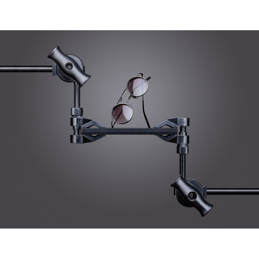
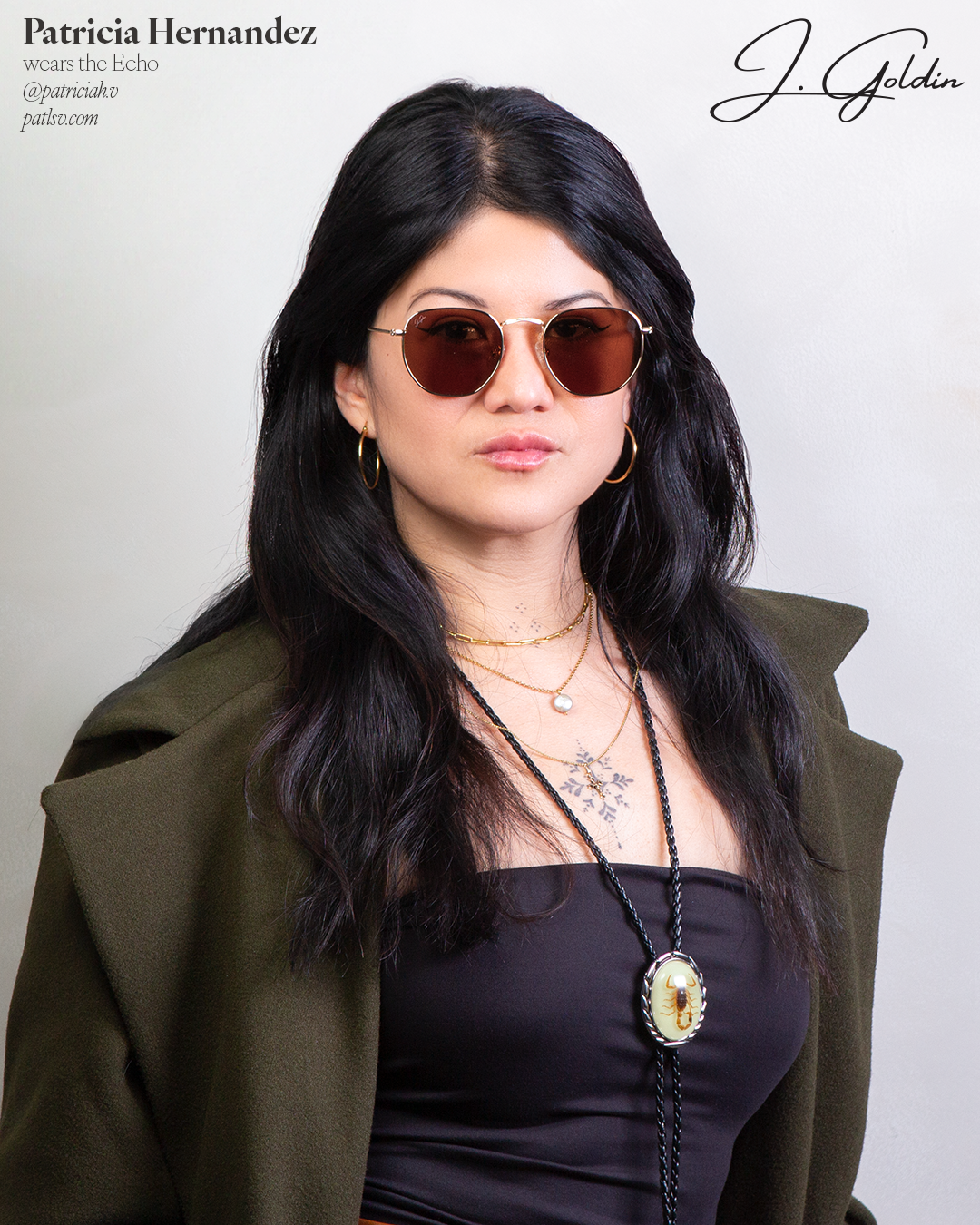
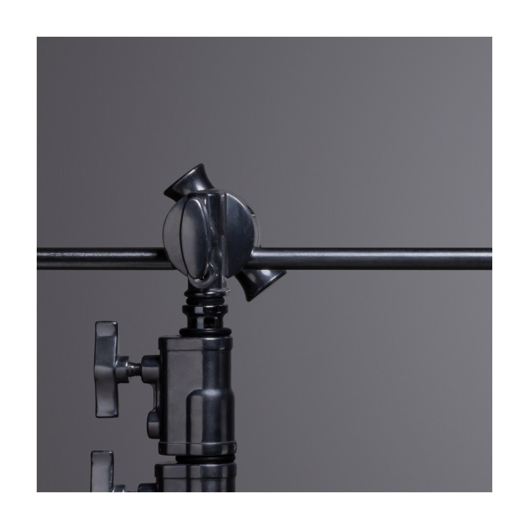
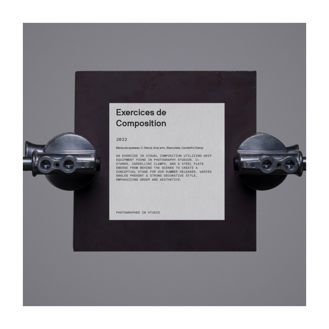
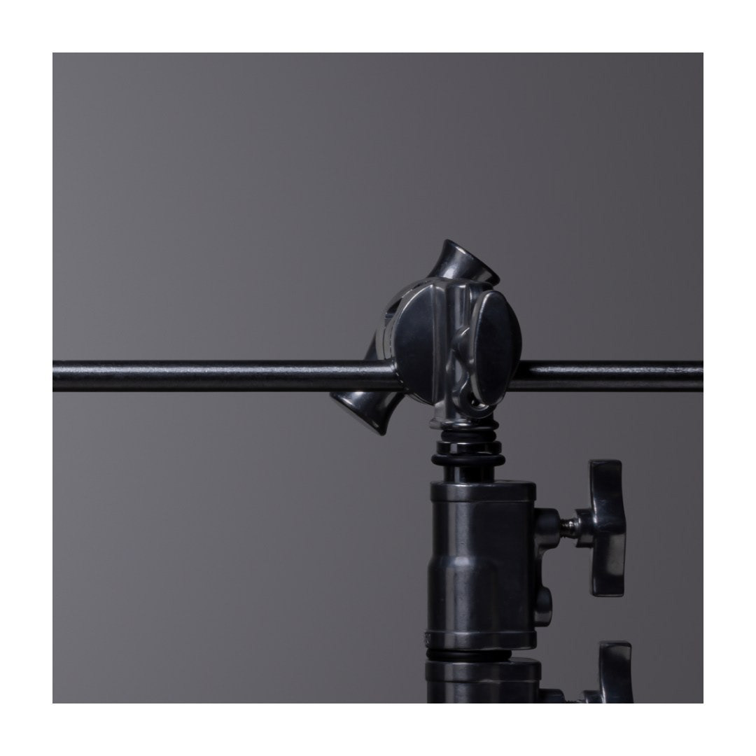
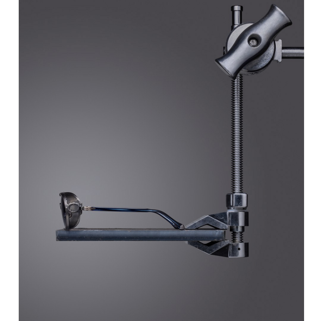
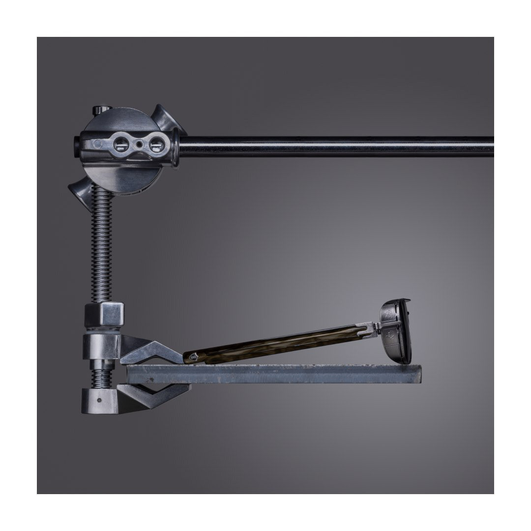
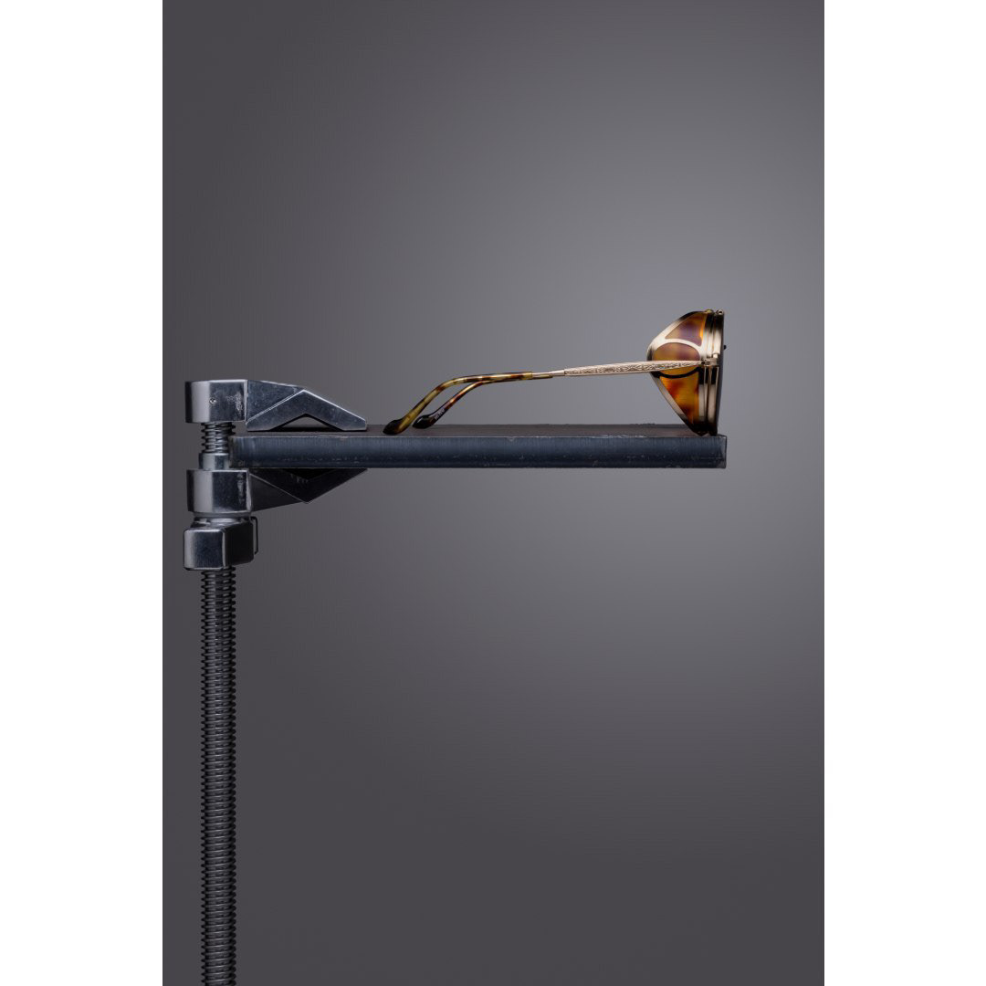
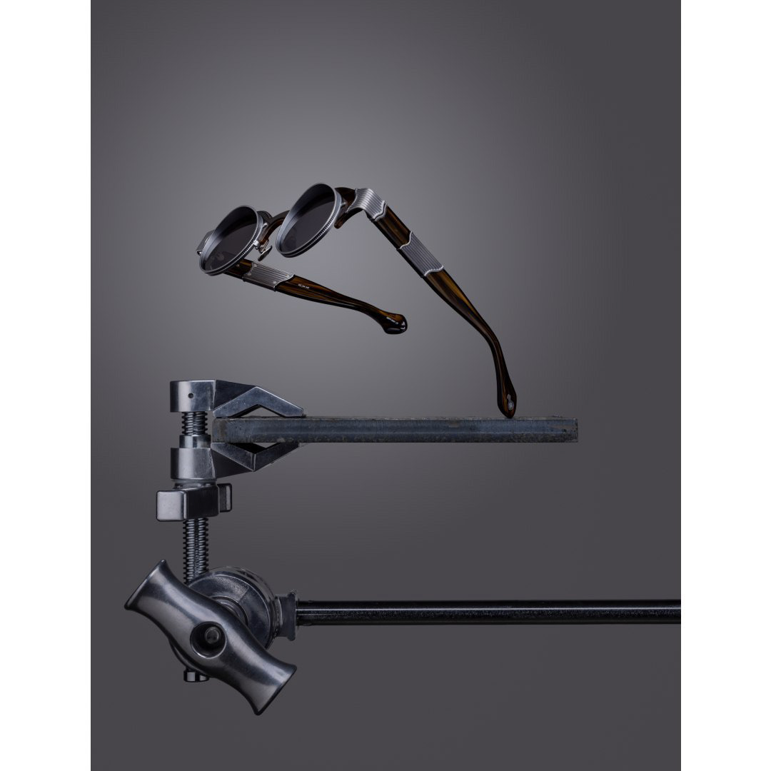
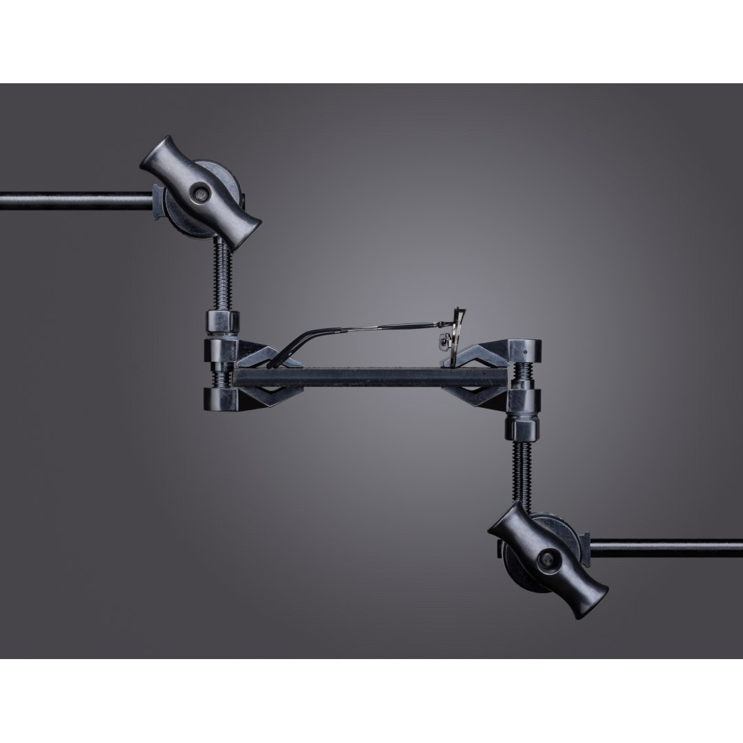
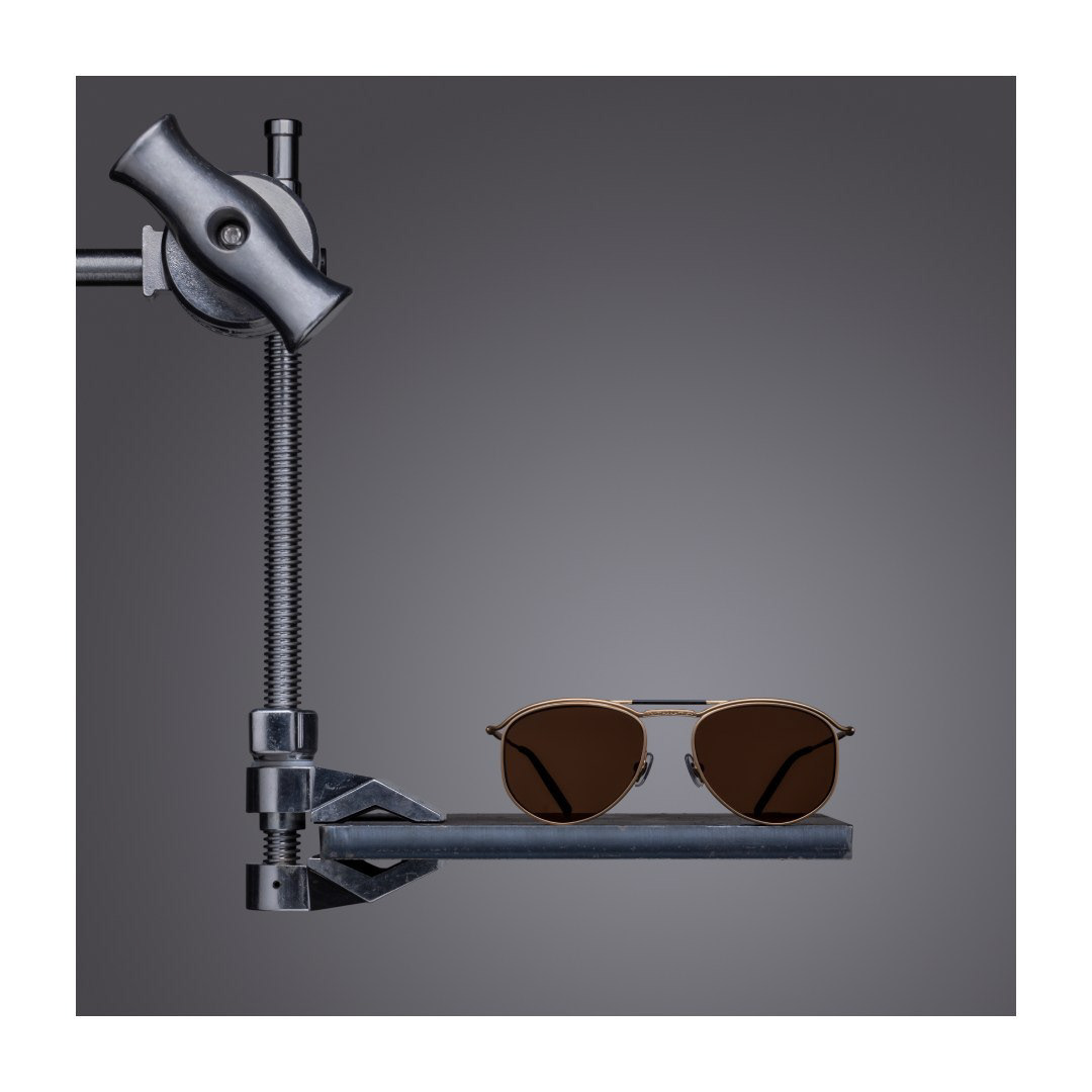
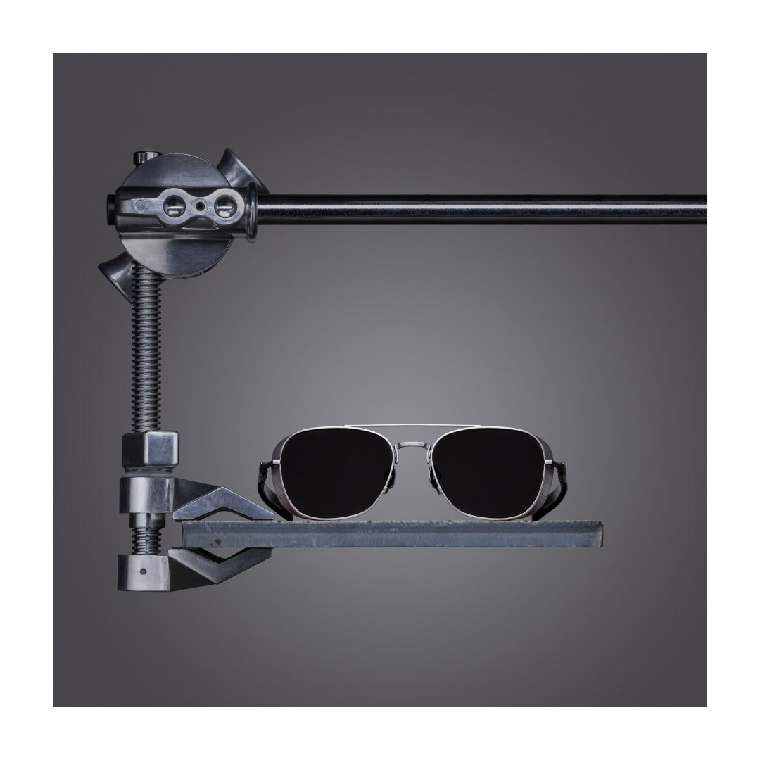
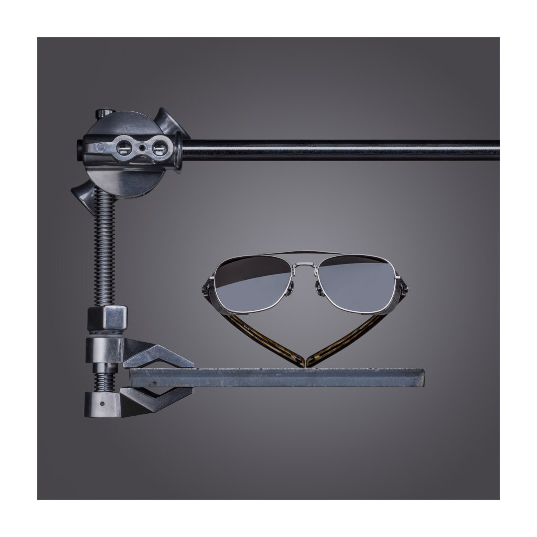
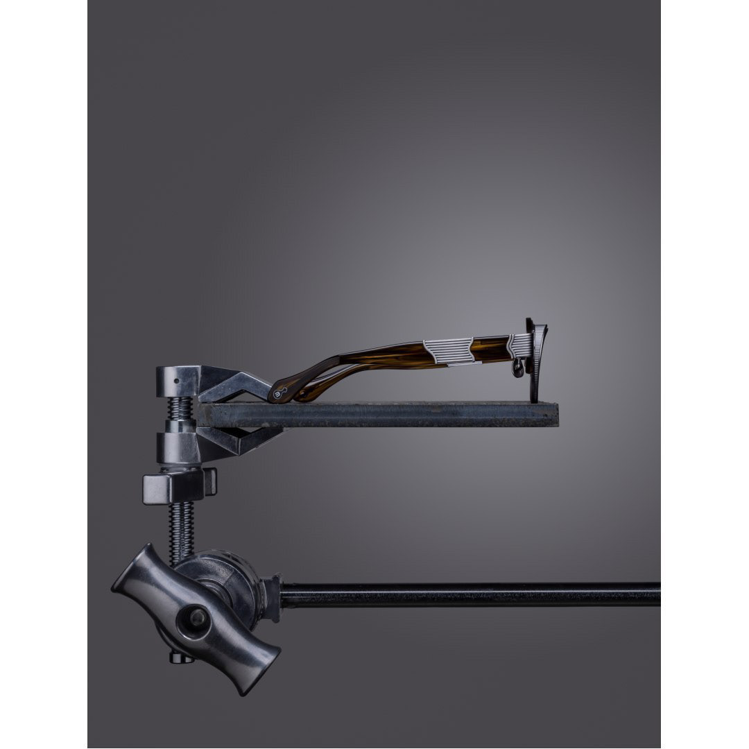
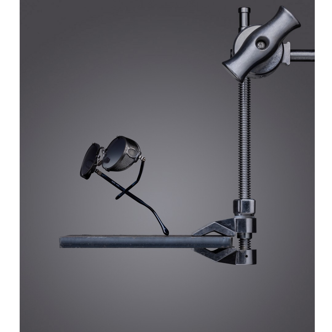
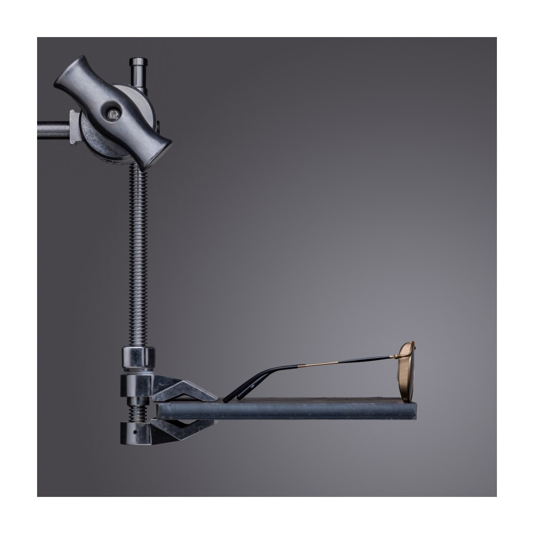
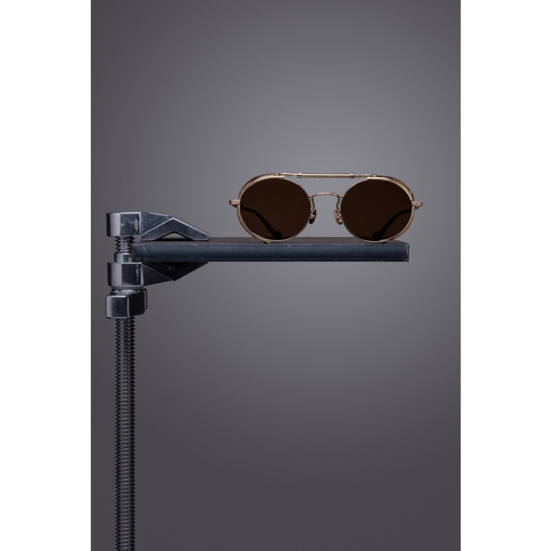
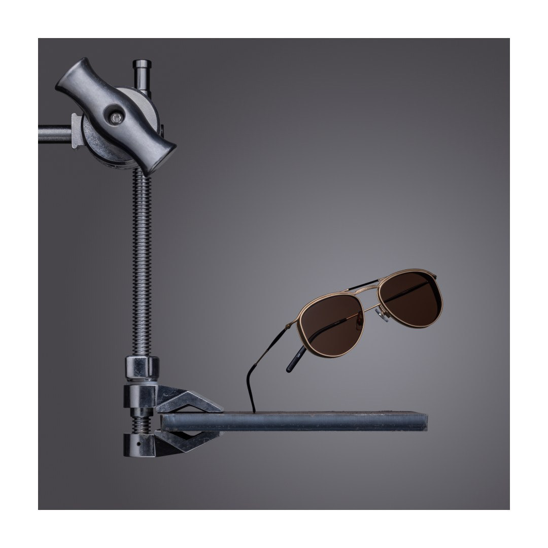
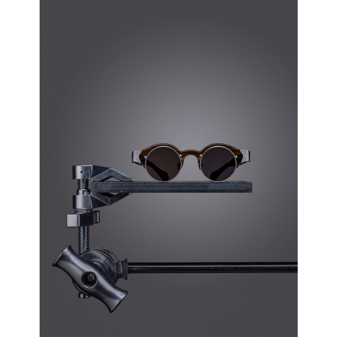
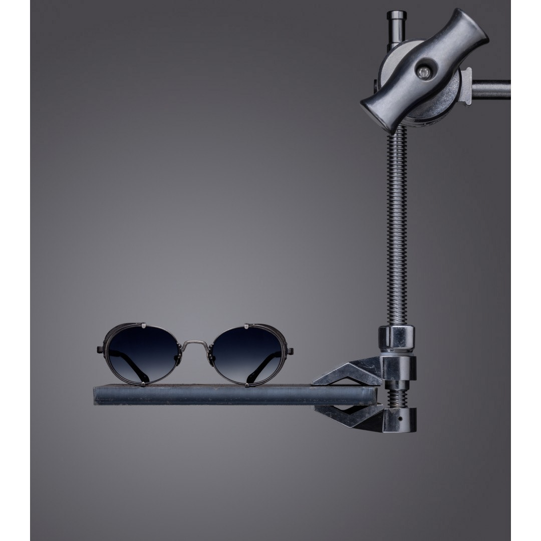
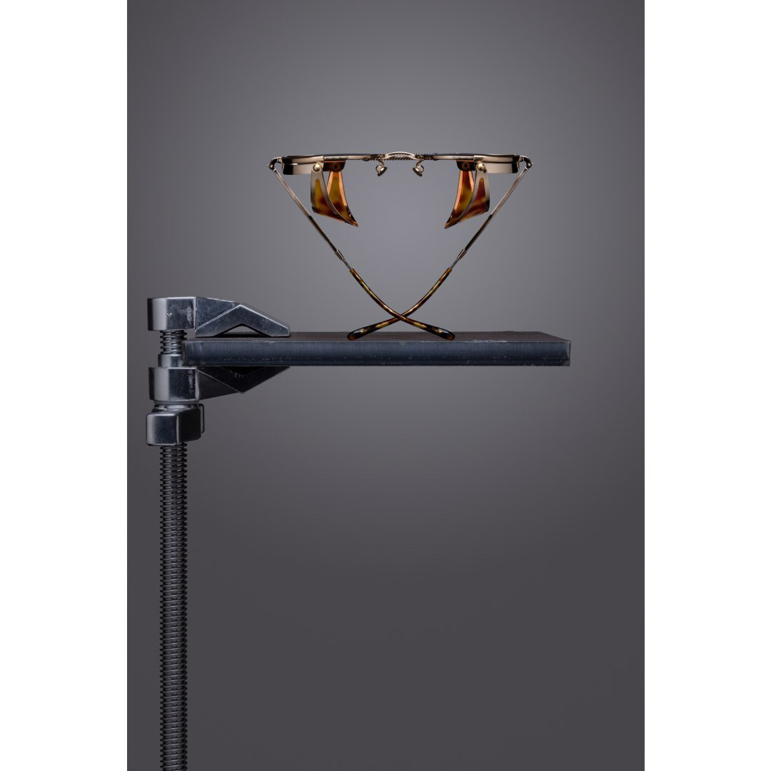
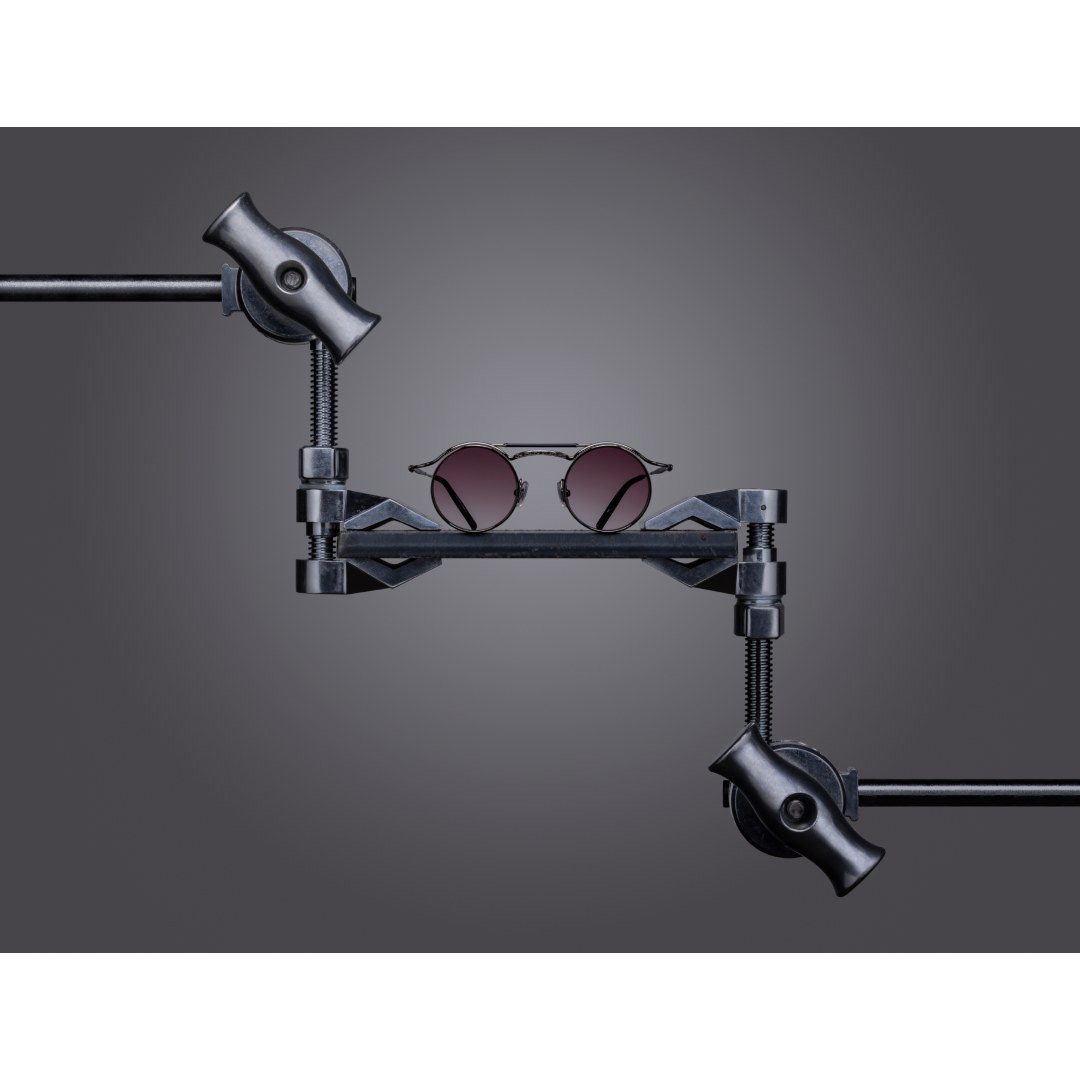
Leaning into the idea of a composition class — the meticulous, iterative practice behind fine art. Set design pared back to near-academic restraint: eyewear staged with Candellini clamps and metal plates. Compositions varied; the system stayed consistent.
Gallery-like lighting that elevated the ordinary to the level of fine art. Each image reads like a museum exhibit — the eyewear becoming artifact, the lighting becoming commentary on the object.
Campaign copy written to mirror museum placards describing art pieces — not product descriptions. Critical essays on objects. The campaign ran across Instagram, client presentations, and trade show materials globally.
The frames featured throughout this campaign — and the broader Exercices de Composition series — were largely developed during my tenure as product & marketing manager at Matsuda. The visual system was designed to hold coherently across those collections, seasons, and years.
"A timeless set of visuals that could flex across social media, client materials, and global trade shows — a consistent, high-art narrative for Matsuda's eyewear releases."
As the sole product manager across Matsuda's three global divisions — Asia, Europe, and the Americas — I oversaw the entire product development lifecycle for the brand's eyewear collections. 100s of SKU releases across dozens of styles. Three continents. From the manufacturer floor in Sabae to the trade show floor at Silmo Paris.
Trend research and consumer insight → mood boards and concept sketches → tech packs and spec sheets → prototype review across multiple sampling cycles → coordinated global delivery. Collaborated directly with the creative director and CEO at every stage.
Designed and maintained large Airtable databases tracking SKUs, color codes, materials, measurements, pricing, and margins. Built a margin calculator in Excel and Airtable. Analyzed 10+ years of sales history using custom-coded Python scripts and business intelligence tooling to inform design and product strategy decisions. Developed a custom XML script to bulk-upload products into the European EUDAMED compliance database — saving hundreds of hours per release.
Traveled to Sabae — Japan's eyewear manufacturing capital — to work directly with the artisans producing Matsuda frames. This is where I began my design journey, learning under 30+ year veteran designers and craftspeople with a depth of material and construction knowledge that cannot be found in any classroom. That proximity to the craft informed every design decision afterward: the weight of acetate in hand, the way titanium catches light, the precision of a handmade hinge. You cannot specify a Sabae frame from a distance.
Acetate design demands fluency in the material's physical language — the geometry of fillets at frame corners, chamfers at the edge and lens groove rim, and how the depth of the barrel cut reveals or conceals the color layering within the sheet. Every decision begins with understanding what the material will and will not do.
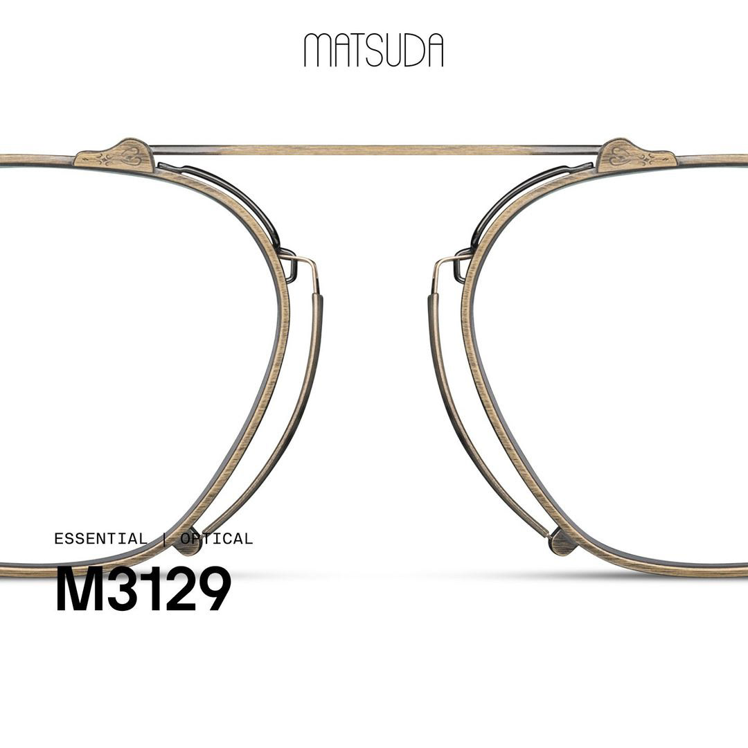
Titanium frames are built through precision-machined components assembled to tolerances in fractions of a millimeter — designing in titanium means thinking in component architecture: the relationship between front, endo, barrel, and temple, each manufactured separately and requiring exact specification. The Gothic Nouveau collection pushed this to its limit with cathedral-shaped pince-nez bridges and stained-glass lacquer inlay.
Combination frames require simultaneous design across acetate and titanium production systems — the hinge junction must account for different thermal expansion rates, while the visual language must hold coherently across two surfaces that age and finish differently. Among the most technically complex products in the Matsuda line.
"Creative direction and technical precision combined with custom-built tools and on-the-ground manufacturing knowledge — enabling Matsuda to release globally compliant, meticulously crafted collections that balanced artistry with operational excellence."
Product photography as fine art practice. For Matsuda's first year and a half, I personally shot the majority of the brand's product photography — developing a meticulous studio process that emphasized light manipulation to achieve the brand's signature aesthetic. The same discipline was applied at J. Goldin, where I built a complete visual identity from scratch.
A three-angle standard per frame — front, profile, and pedestal. Studio lighting designed to reveal the material character of each colorway: the sheen of matte titanium, the depth of acetate, the warmth of brushed gold hardware. Directed teams of retouchers to refine and finalize imagery to the same standard.
Shot and retouched the full J. Goldin product line — establishing a visual language consistent with the brand's luxury positioning. Served as both lead photographer and creative director for the "City of Muses" launch campaign.
From brand brief to finished luxury object. Every engagement follows the same rigorous sequence — whether building a brand from zero or designing a single style for an established house.
If the brand exists: deep archival research, identity audit, and competitive context. If it doesn't: building mission, vision, design DNA, and visual codes from the ground up. Either way, this is where every downstream decision is rooted — and where most design processes fail by moving too fast.
Translate visual references into precise written design codes: the specific language describing proportions, surface character, emotional register, and material behavior. A brief rigorous enough that every factory, photographer, and collaborator can work from the same frame of reference.
Map the competitive field in granular detail: silhouettes, shapes, material approaches, price positioning, and production quality. Understand what exists, who makes it, and at what level — before proposing anything new.
Define the specific opportunity: the silhouette, material system, or positioning territory where a new product can own distinct ground without collision. The negative space of the competitive map is where the design brief is written.
First marks on paper. Rapid iteration across silhouettes, proportions, and construction approaches — without constraint. The stage where ideas cost nothing and every direction has permission to exist before the best ones are identified and developed.
The strongest concepts translated into precision linework: front, profile, and top views, dimensioned to actual scale with core measurements and construction notes. The moment intent becomes specification — and the point at which a design either holds or reveals its flaws.
The first full technical document: all measurements, construction method, hardware specifications, and material references. Detailed enough for a factory to begin first prototypes — precise enough that nothing is left open to interpretation.
Color, material, and finish decisions made in hand — not on screen. Acetate sheets, metal swatches, plating samples, and hardware finishes are ordered and reviewed physically. You cannot specify a luxury colorway from a JPEG. The material has to be in your hands.
Complete the documentation with confirmed CMF: every colorway specified by supplier code, every hardware reference locked, every finish method documented. Production-ready — nothing missing, nothing ambiguous.
Where the design calls for it: full Rhino 3D models to resolve constructions that cannot be specified in two dimensions alone, to validate proportions before sampling costs are incurred, or to create client-facing visualization at a level technical drawings cannot provide.
Match the design to the right production partner — by material capability, quality tier, minimum order, and lead time. Either establishing a new manufacturing relationship from scratch, or engaging one of Tristan Hackman Creative's trusted partners in Sabae, Japan, Italy, or China. The factory is not a vendor. It is a collaborator.
Full production cycle management: prototype review, sampling corrections, production sign-off, quality control, and final delivery of a finished luxury product — on spec, on time, and built to the standard the design deserves.
"Twelve steps. Every time. Because the difference between a product and a luxury object is the attention paid to each one."
I specialize in luxury eyewear product design and development, working at the intersection of creative direction, engineering, and manufacturing to bring high-end collections from concept to production. My experience spans full product lifecycle execution, factory collaboration, and translating brand vision into commercially viable luxury products.
I studied Psychology at the Georgia Institute of Technology, where my research in perception neuroscience and creativity led to a published study, The Nature of Creativity (2016). This work gave me a deep understanding of how people process visual information and what variables shape the construct of creativity. It continues to inform my approach to design, material selection, and product strategy, grounding my creative work in both research and real-world execution.
"What is the nature of creativity? Working Memory Capacity and Fluid Intelligence are strong predictors of both Divergent and Convergent processes."
I began my professional career at Matsuda, a heritage Japanese luxury eyewear house, where I developed my product expertise working directly with master craftspeople in Sabae, Japan — the historic center of Japanese eyewear manufacturing. As the sole Product & Marketing Manager for all three companies that made up the brand worldwide, I worked across the full product development lifecycle, including trend research, concept development, technical drawings, prototype review, and final production execution. I also developed internal tools and databases that streamlined production workflows and saved significant time each season. During this time I collaborated closely with leadership to help align product execution with brand storytelling and campaign direction.
I later carried this experience into a leadership role as Chief Product Officer and Lead Designer at J. Goldin Eyewear, where I led the design and development of the brand's inaugural collection, from early concept work and tech packs through manufacturer sourcing and final production. Beyond product development, I helped shape the brand's creative direction across identity, packaging, catalogs, and launch campaign execution, helping establish the foundation of the brand during its early growth phase.
Today through Tristan Hackman Creative I work independently with brands and founders on luxury product development, design direction, and eyewear consulting. I am particularly interested in collaborating with companies that value strong product thinking, craftsmanship, and thoughtful execution from concept through manufacturing.
Available for product design, brand creation, creative direction, and consulting engagements. Based in Atlanta, working globally.